Objective
Compose a single-page mobile web site with minimal navigation that tells about 3 of your favorite things.
Wireframe
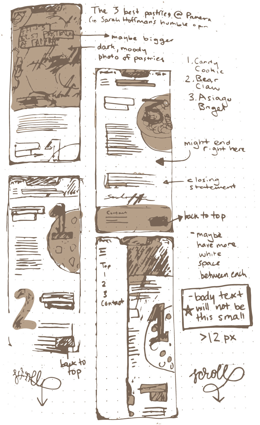
I prefer analog sketching, so I started with pen and paper, determining the general layout of all of my site's elements. Going into this I knew that I needed to include and consider the following site anatomy:
Header area "above the fold"
3 "things" with headers and body text
footer area with contact info and breadcrumbs
navigation within the single-scroll
hero / feature image(s)
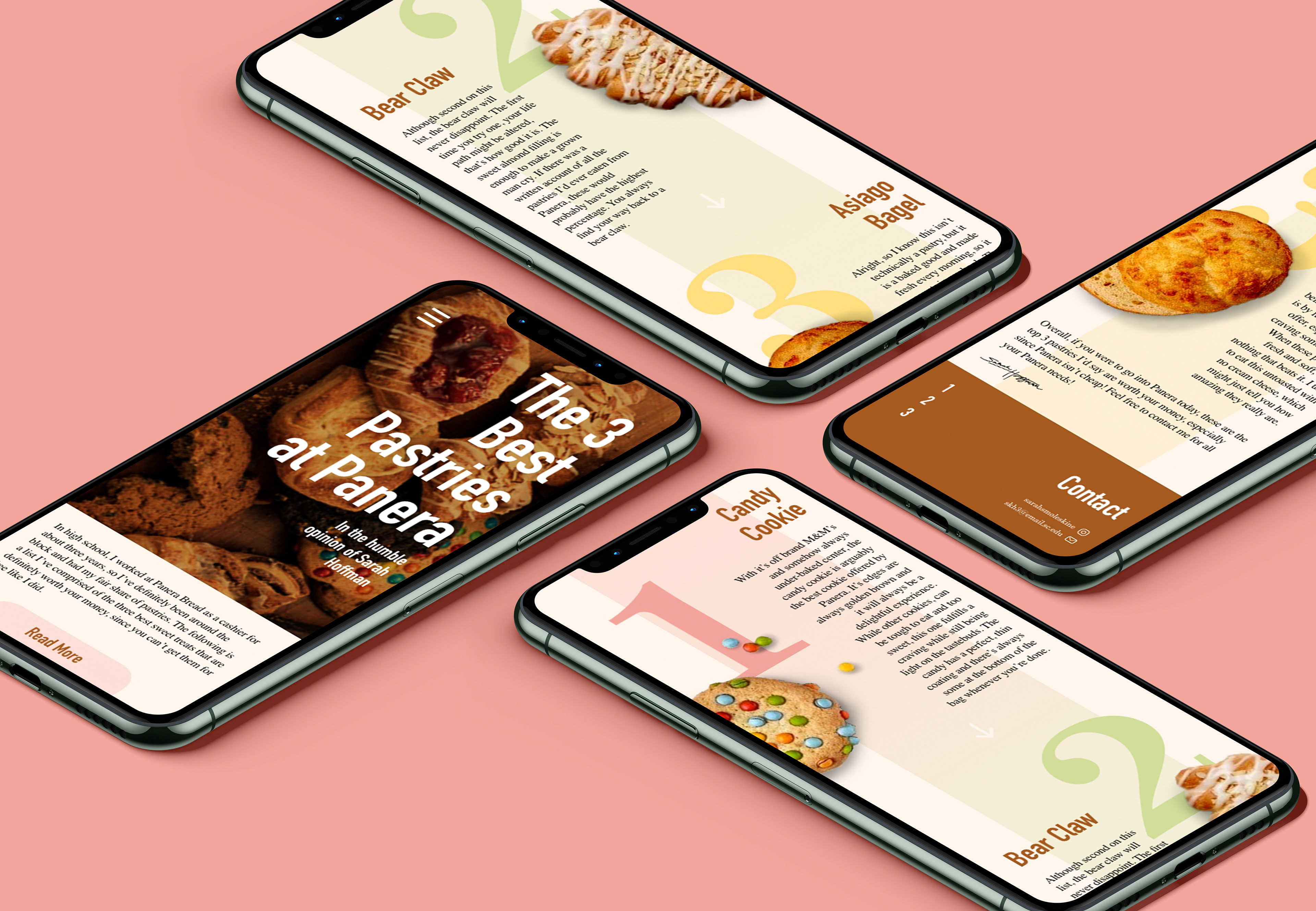
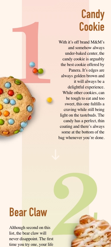
I decided I wanted to do a two column grid for this project, which is not common for mobile sites because of the size restraints, but I thought it would be nice to have the pictures next to the text. I decided to have my images have no background to look like they were coming off the page.
Originally, I wanted my navigation to be a menu that slides out with a colored background, but in execution I realized a simple drop down would be more effective.
Site map
I then moved onto a basic site map of what the site would look like from a distance. This indicates what each link or button will take you within the site, since my project used no external links. It is extremely minimal because it is a single-page site.
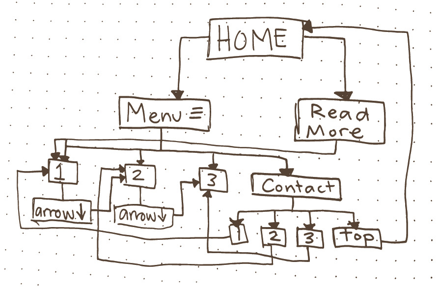
Learn more about site maps here

Site Features
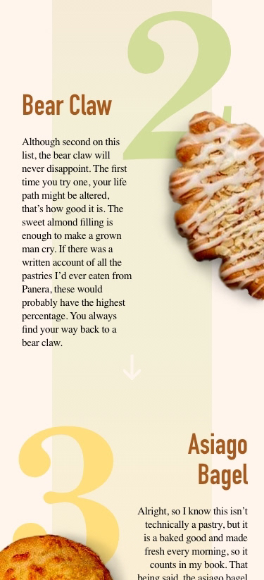
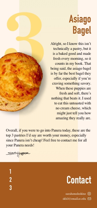
I added a Read More button above the fold to make it more obvious that there was more to see if you scroll down. If you use the prototype, you will also see a "back to top" button when you scroll. This was really important to me as a breadcrumb for the user. I also added a runway down the middle of the screen to unify the two columns and lead your eye down the site. It also has a gradient that is color coordinated with each pastry. Each button is also color coordinated when hovered over or clicked on. For example, if you click on the number 2 in the footer, it will turn green and take you back up to the second passage about bear claws, which is colored green.