
Chapter 5: Strategically Creative Design
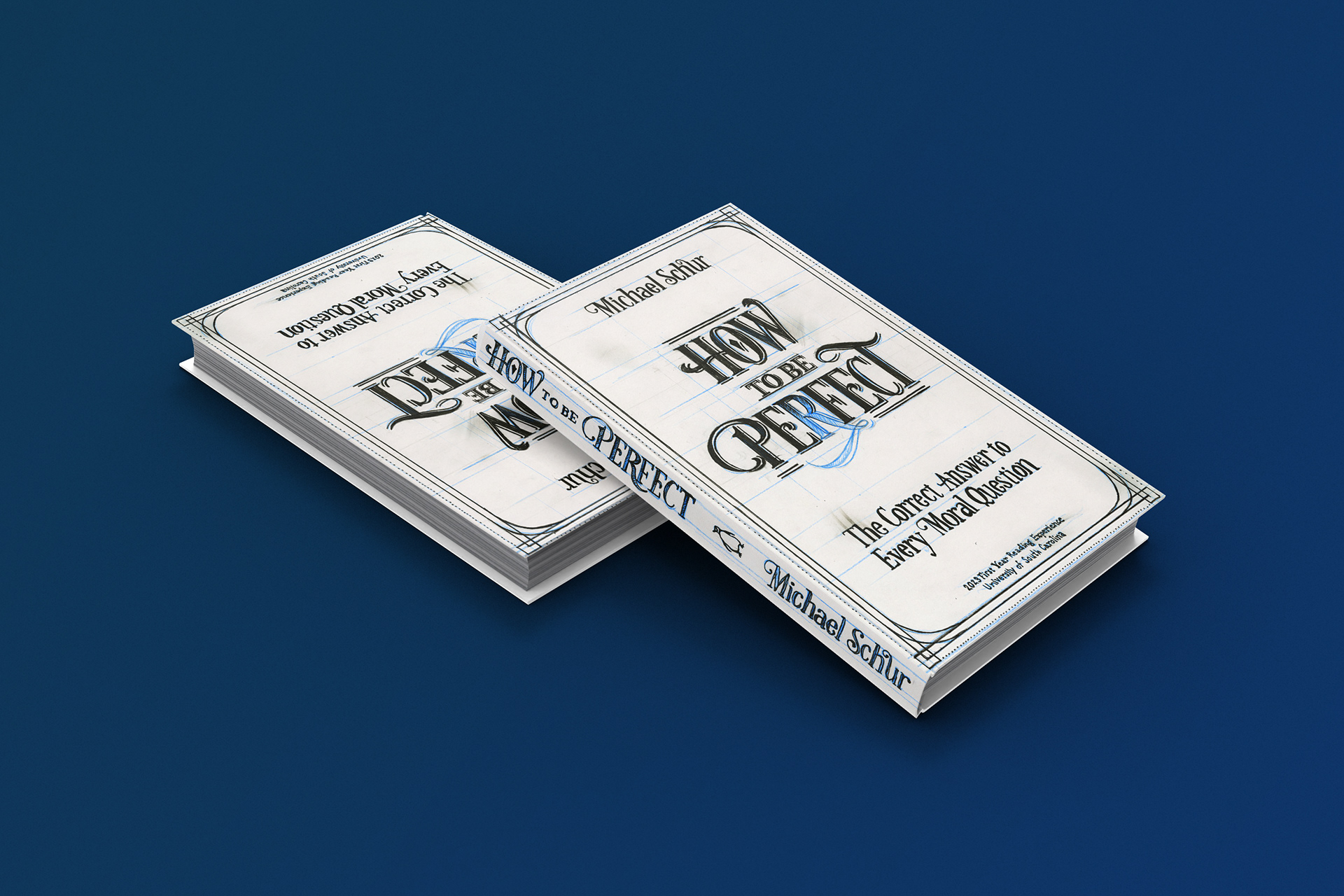
Even just the start of the chapter was a great reminder on how design actually is effective and makes an impact in the marketplace. It is sometimes easy to forget this when you do similar things repeatedly for each project. It's hard for each thing to stand out as an individual in my mind, yet if these things I'm designing for were placed among their peers or similar market items, would they stand out? It's a good question to ask, and one I'm pondering for my current and past designs, with my Peebles project and even my book cover from last year's FYRE competition. I would love to see that book cover among other novels on a shelf, and hope to one day see this in my future projects.
I have actually been reflecting recently about my more editorial, print, and text heavy design, and how it relates to the principles of design. In analog work, I feel like these principles come very naturally to me, so much so, that I don't really think about creating them, they just happen. In my design work, I do think there's more of a struggle to the end result, though, and I'm not sure why. I am still confident in my abilities, and definitely know more about spacial awareness on a page than I did a year ago, but it still doesn't come as easily to me. I was thinking about this even just for my brand guidelines presentation. I do feel like more textual information could have been given for do's and dont's so I could give it to a client as a pdf that doesn't need further explanation in the future. Maybe this doesn't come down to my textual layout skills though as much as it relates to body copy? I'm not sure, I think they go hand in hand.
Another thing that I think I could improve on is choosing typefaces. This is definitely an area that I could broaden my horizons on and I'm definitely trying. I like to watch fellow designer's youtube videos on their favorite typefaces to be exposed to more things. Two typefaces that I've started to love from those videos are Din Condensed and Grad. The only thing is, right now, I couldn't make one of those videos myself, and definitely not to the extent that some designers do. I definitely see the appeal and beauty in type, it's just something that I could know a little better. Something Robin said that I liked and will take with me is:
"To appreciate the design of a typeface, look at the shape of the letterforms, the inherent balance in the design of each letter of the alphabet, the proportions, the axis, the characteristics of the letterforms’ shapes (shape of the letter) and the open spaces (counterforms), and the detailing (shape of the serifs or lack of serifs)."