
Chapter 6: Branding & Art Direction
I was intrigued to read this chapter, because art direction has always been something that I've been interested in as a career, whether that be in print, film, or any other company/business that has an artistic side to it. This role is something that I'd like to work my way up to one day, I think.
I did not expect Robin to start this chapter the way she did, talking about telling the story of the brand as a whole. I guess I didn't have any idea of what TO expect though. The idea of being a brand storyteller is daunting to me, especially being the person who is determining how to interpret a brand personality or archetype into a visual system. RObin say many companies think they can say something but not back it up, and I sometimes feel like my justifications for brand strategy are half-baked. How can you know when the final good idea has come?! How do you know exactly which direction to take it !? I'm getting stressed just thinking about it.
I do feel like a way to calm these nerves, though, are to make sure actions of the brand line up with the message of the brand, exactly as Robin is saying. This is much easier said than done though, I feel. A company has SO many decisions to make and making sure that every single one of them flows through a detailed brand identity sieve seems exhaustive and repetitive.
The brand storytelling Archetypes were actually helpful in a way I didn't think. I had to get myself out of the box to try and think how these plots could relate to my Peebles brand identity. I'm not sold on anything yet, but even just thinking of my Viking chicken as overcoming the monster of boredom, was a great way to get my mind thinking about the mural designs and advertising body copy/text that I'm working on right now for my presentation on Monday.
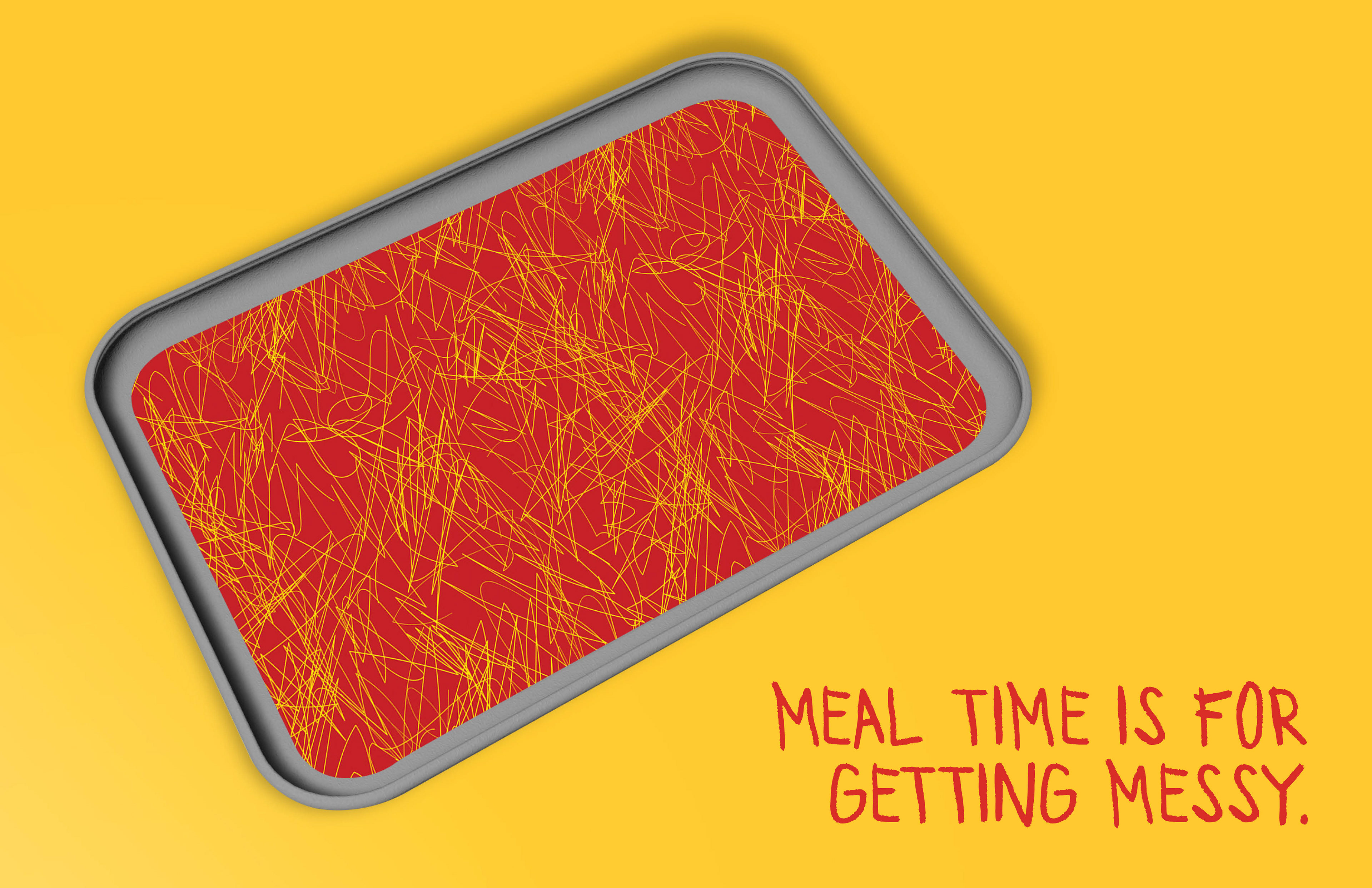
Another thing that motivates and inspires me is the notion that Rob Reilly shares, "for the best ideas, you need to have some level of risk or some level of fear that this won't work." I'm really trying to think of things that would be new and exciting for Peebles to do for engagement that I could possibly include in my project. I was proud of the line, "Meal times are for getting messy, and I'm thinking I should try and capitalize off of that somehow. Or maybe the viking thing.
The style of campaign things is where I'm on track, but also things get fuzzy for me. I feel like a great way to switch up a style or shake things up is by using an under-utilized color in my color scheme, or doing something unexpected like that. However, that kind of goes against my original guidelines that my dark blue color should be used only if necessary. But maybe, a campaign like that would be one of those times when it was necessary ! SO many things to think about and decide on as an art director and this chapter really opened my eyes to that!