
Objective
Dissect a web page and identify what makes it successful or unsuccessful by highlighting it's anatomy
Bad Example

WEB
uses the same font and weight for everything, heirarchy is not clear
no breakdown of menu, hard to navigate from page to page
info overload
Not a clear call to action
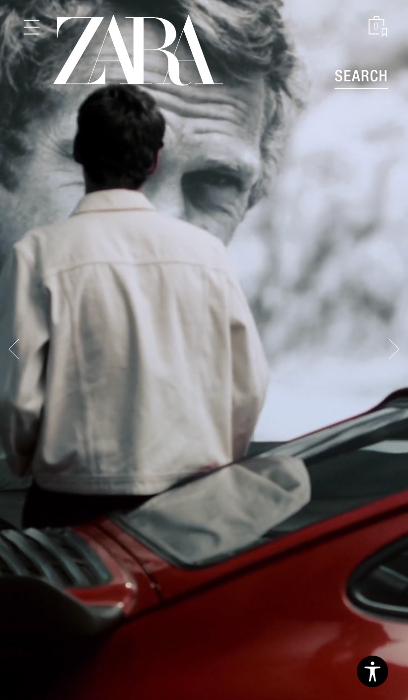
Mobile
No call to action
No context for what the brand is about/ what they are selling
Not a lot of information above the fold, user needs to keep scrolling to find it
No indication to scroll
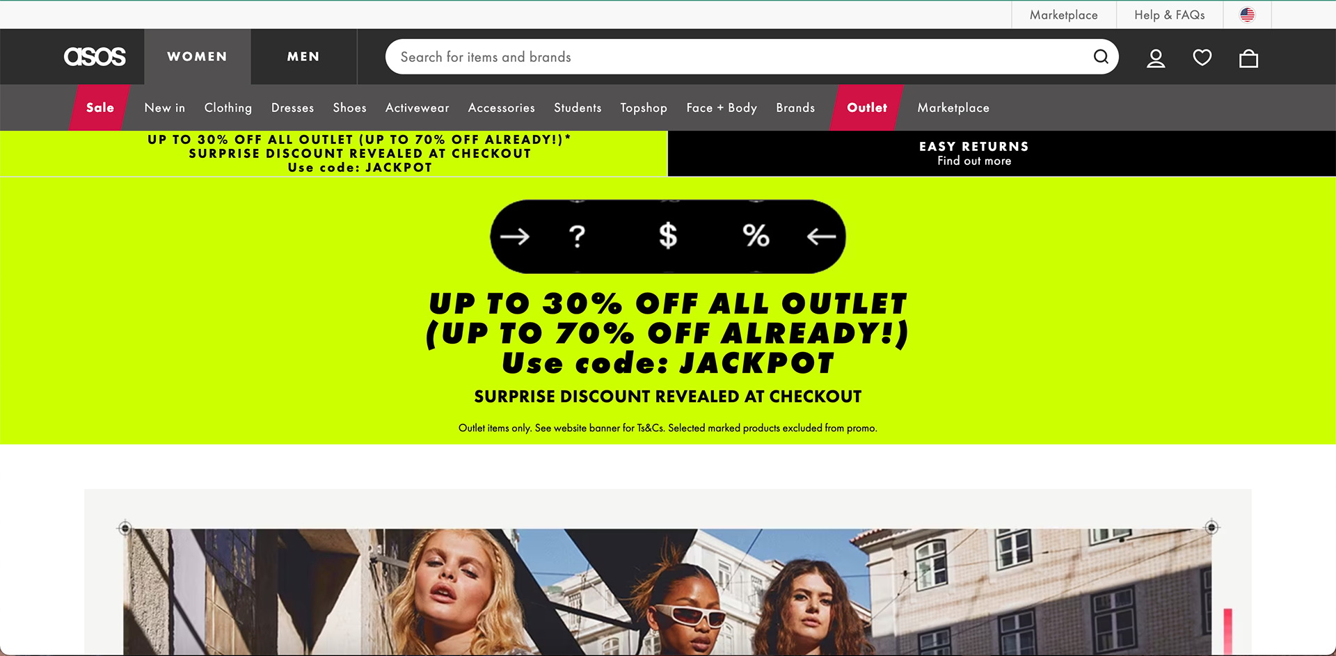
Good Example
Desktop
clear search bar, with good contrast
breaks down the menu into simple to use categories
organized footer with clear titles, easy for website navigation
Easy to see important information


Mobile
Easy Navigation
Good secondary call to action, Above the fold
Hero image
brand ethos/ hero text
User friendly categories
Clear call to Action