
Inquiry 5
This inquiry was arguably the most excited and prepared I've been for an inquiry. This idea of repetition and consumerism is something that I've explored in my work before and I want to continue to do that. I also did more preliminary sketches than I normally do. I think for this project, I really view these options as first drafts rather than a final product. There are many things that I'd like to change or fix to make them look more like my original ideas.
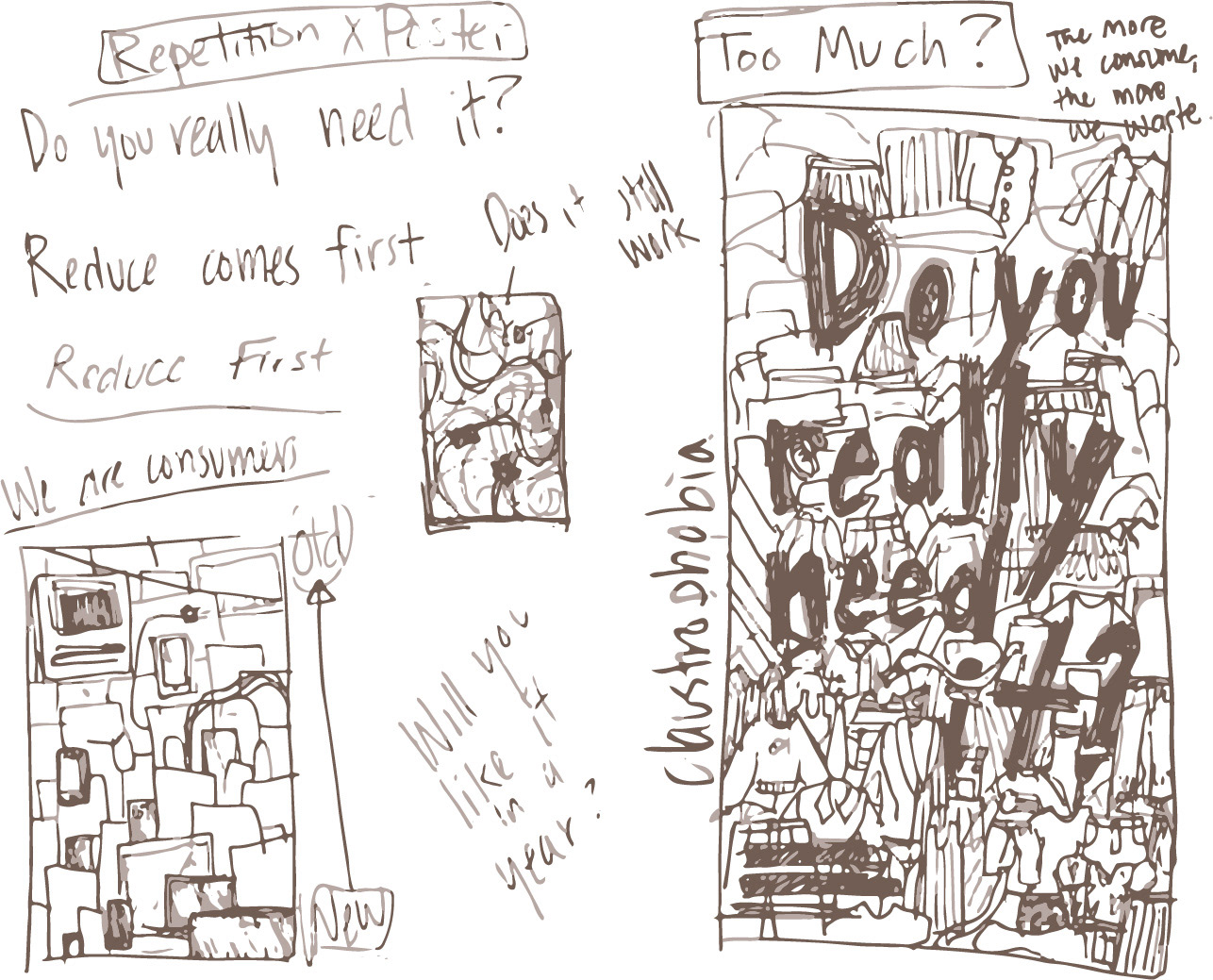
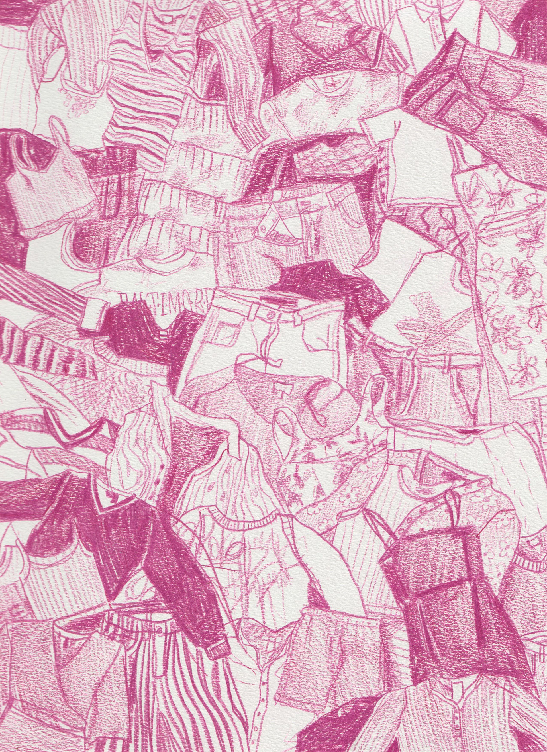
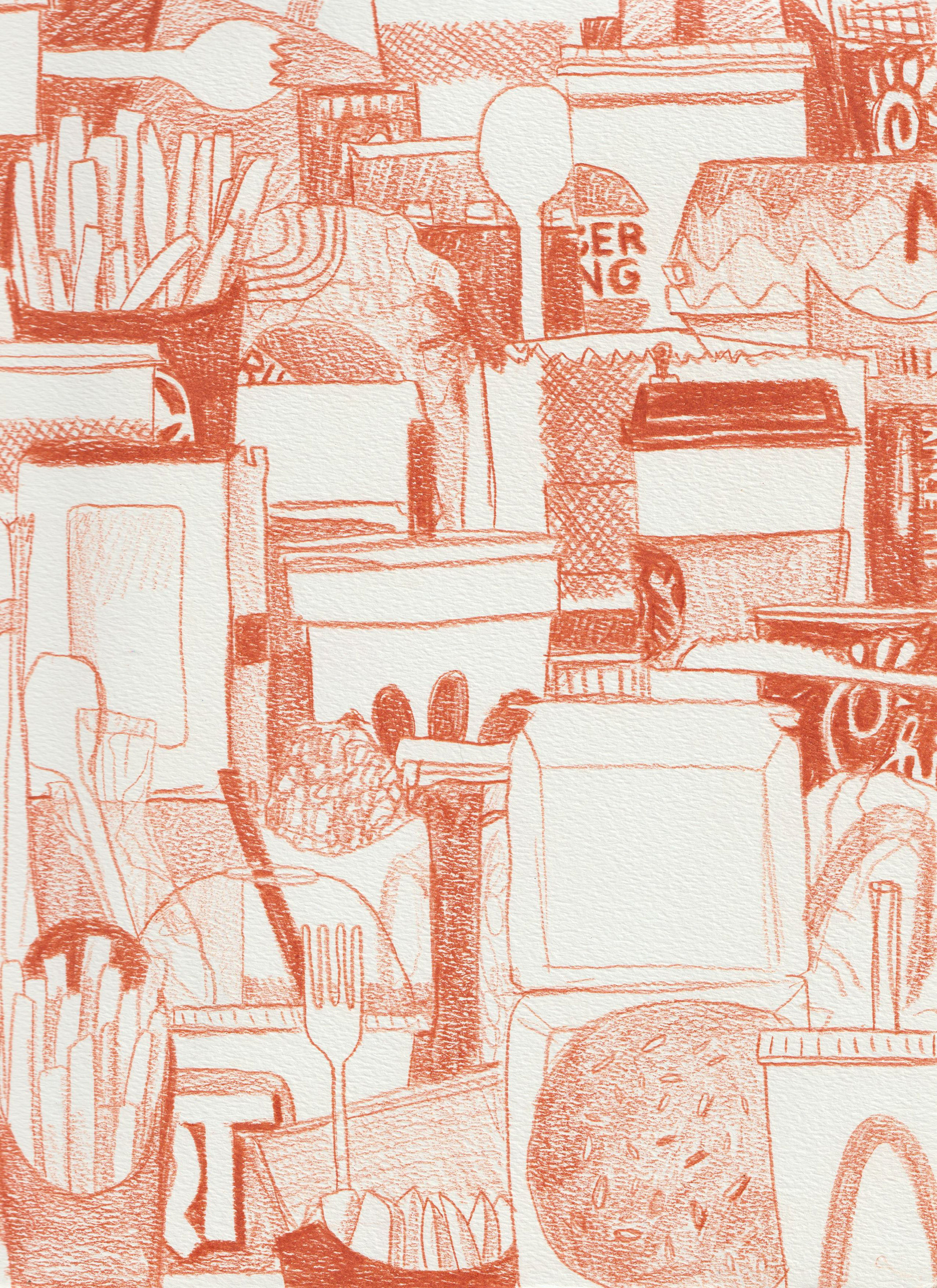
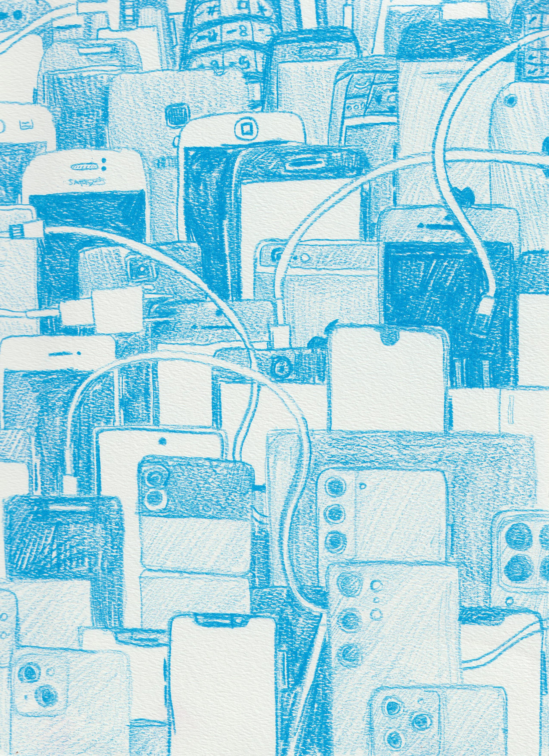
my original sketch ideas for this Inquiry
Far starters, I never intended them to be these bright colors and they only are that way because of the colored pencil I used in my illustrations. I only used colored pencil really, because I didn't have a pencil when I was first starting my phone illustration. My original intention was to have flat color blocking design with limited color palettes for each. I don't necessarily think I'll do that per say, but I do want to add color to each design. I think it would look good if the phone design was a limited color palette of blues, grays and golds reflecting the actual phone designs, but the clothing illustration would benefit from more color. I'd also want to add shadows to everything because I think it would enhance the illustration.
I also don't really like the rectangle at the bottom. Without it, I was having some legibility issues, but I'd really love to be able to figure out a way to have my illustrations go fully off the page on every edge of the poster, because I think it enhances and supports the overall message. I want to change and rethink some of the tag-lines at the bottom, specifically in the food poster. Right now it's something generic about demanding change, but it doesn't really speak to reducing consumption on the poster. I'm really happy with the phone tagline--it says "Repair. Don't Replace." and I want to model more tag-lines after that.
Overall, I think that even if I don't choose this for my final inquiry, these are still revisions I'm likely going to make one day, because these posters are something I definitely want to put in my portfolio, and they just aren't where I'd like them to be right now.
Design Observer: Ep. 95, Back to Basics
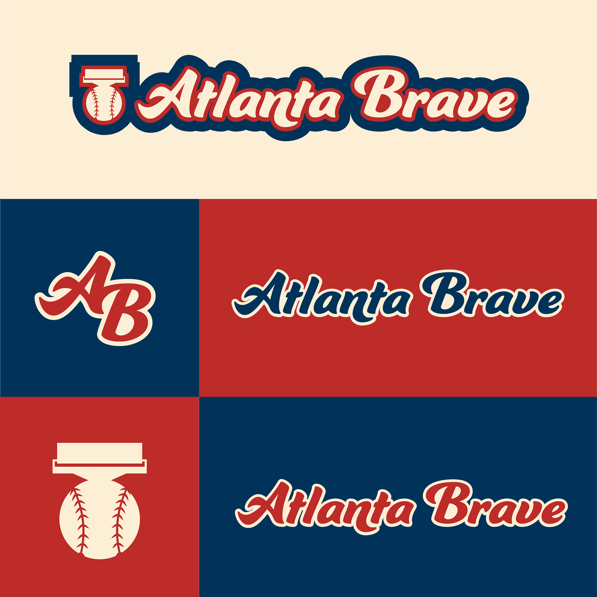
This conversation of logos becoming more simple and "boring" has actually been something I've been reflecting recently. I watch a lot of design youtube videos about design trends and redesigning logos, and a common theme that I'm sure we've all seen recently is the move towards very simple san-serif typefaces and pared down versions of originally complex logos. I feel like young designers, myself included, like the trend towards simpler logo design because, despite the skill that is still needed, it's definitely a lot easier to create a simple design than a complicated one. I've been reflecting on this recently with my old design work in Typographic Design 1.
For my sports brand redesign, I chose the Atlanta Braves, and my logo definitely fell into a modern, simple version of a baseball logo. I now realize there's a problem with this: it doesn't look like a baseball logo. It takes a lot of the character and context of the Atlanta Brave brand. When designing logos, you should be able to look at the final result and get an idea of what the brand is about--I.E. you should be able to distinguish between a corporate, medical logo and a fun, ice cream business logo, no matter what the business name is. I feel like a large part of why this logo looks modern and simple is because those were the only kind of logos I was looking at for inspiration at the time. At the time, I didn't know how to make a baseball logo.
from ARTS 245, sophomore year