
Coffee
Another idea I have to repackage is coffee. Coffee is truly something that I and so many other people use every single day. I like to ground my coffee at my house, but it is easier to grind a couple days in advance, because it makes mornings quicker. Additionally, if I try to ground only enough for one cup, some stays in the grinder and it’s never a perfect amount; I could have made not enough or too much. The problem is that when I ground too much or have multiple days in advance, I have nowhere to put the extra coffee grounds. Some people buy a container for their coffee grounds but I have to put mine in a random tupperware. My thought is that maybe there is a way to include a compartment in the coffee packaging where you could put your extra grounds.
Coffee beans lose freshness quickly after they are roasted with exposure to oxygen. They will lose their scent and taste stale, and the fat within the bean can even turn rancid. Additionally, roasted coffee beans also let off gas; because of this, most coffee bags have a valve that allows carbon dioxide to exit the bag, but no oxygen to get in. If this valve wasn’t there, the coffee bags would burst from air expansion. As a note, darker roasts let off more gas. During roasting, the water vacuoles with the plant cells dry out and create a porous texture on the surface of the bean.
Master Class gives 7 tips for coffee ground storage:
1. Avoid the refrigerator because it has a lot of moisture.
2. Pay attention to the expiration date. This is valuable to think about having a clear open space for the expiration date to be printed.
3. Freezing grounds help them stay fresher for longer.
4. The grounds should stay in an airtight container ***
5. Store the grounds in a dry place
6. Wait to grind within a week of using, or they will lose freshness and flavor. This is important because it highlights the positives to buying whole beans and not ground beans in the store. There is no way to know how long ground coffee has been in the bag.
7. Grounds go bad within a month.
Foodcrumbles.com has an article on proper coffee packaging and it says that it must be made of a material that doesn’t let molecules pass through, like metal cans or laminated film. Laminated materials are made of multiple different layers, with one often being metal, and every layer having its own purpose. Laminated materials, however, are not as sustainable because they cannot be recycled. They also give some additional tips for how to prevent bags bursting with carbon dioxide, without a valve necessarily:
Leave the beans to degas so the majority of those gases have left the coffee beans before they’re packed. This may take a few hours, up to a few days. The majority of gases will escape in the first few days, with quantities flattening out over time.
Pack the beans in a pack that can resist some pressure. Some degassing is likely still necessary, but when using a pack that can withstand some pressure you need to degas for a shorter amount of time.
Some ideas I have currently is a cylinder or square metal container that opens from both top and bottom, one side used for grounds, and one side used for beans. Somehow the bean container gets smaller while the ground coffee side gets bigger, they replace each other’s volume. Another idea is the same metal or square container but with a stackable, compartmental lid. Maybe the lid is something you can buy once, but sits on the top of each coffee pack you get. The compartment for the grounds needs to be deep enough that it is not annoying to put a spoon or something in to scoop out the grounds, as well as being airtight completely.
Menstrual Pads
I’ve decided to repackage pads, possibly tampons, and other menstrual products. I chose to do the product because currently, I have a ripped open plastic bag of pads on my floor with product spilling out, with no order or aesthetic appeal. A desire for a better solution for storage and access is one that I believe can be addressed through packaging. Although these are not products that are used every single day, I believe they pose a packaging question throughout the month. How can they be most helpful in a time of need and also hidden or forgotten about the rest of the month?
All top 10 of the most popular pads of 2023 use this unstructured, plastic casing for their products, 5 of which are from the brand Always and the other 5 are Amazon brand pads, all of this according to The Jerusalem Post (Schoeman, 2023). Some other best selling brands on Amazon are Rael organic Pads, U by Kotex, and Stayfree. Some of these brands adopt a cardboard box solution, which is definitely easier for storage but is not user friendly in terms of use and access, having only flaps to open on each side, which could get in the way and is not accessible at any angle. Another thing to keep in mind, is making sure the product has ethos and credibility as a brand. Personally, I might be wary to pick up a larger cardboard box of pads, if I’m used to buying a plastic package.
According to Business Wire in 2015, the dominating brands in the menstrual product world are Always (Proctor and Gamble), Stayfree (Johnson and Johnson), and Playtex. All of these brands drive the market mainly with consumer brand loyalty, making it extremely hard for smaller, newer companies to breakthrough the market. Although this data is outdated, I believe we can truly see the effects of this today in our own shopping habits, especially in the health and hygiene spaces.
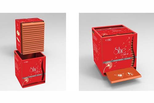
A packaging company called Logos listed some different possible packaging solutions that already exist for sanitary pads, those being: stand up pouches, pad pouches (like a wallet), plastic bags, vinyl packaging boxes, metal tins, side sealed pouches, pillow pouches, and gussets pouches. Out of these I believe the vinyl packaging is the most innovative and interesting to me, as it is similar to a pez dispenser, with one available at all times to grab. This is something you are meant to restock. However, this design only is able to be stored in one orientation, which is a setback. The below is the example shown of the vinyl packaging box, a product design done by 3 designers who defined the original packaging’s as:
1. Not eco-friendly
2. Brands lack visual differentiation
3. Too much unwanted information given all over the packaging
4. Important information not highlighted
5. Inner wrapping provided is useless as most users use newspaper to dispose pads (designers are from India)
Alvina Rajendran, Maanasi Shankar, and Divya Murali
Moving forward, one option is redesigning Always’ packaging, instead of creating a brand from scratch. Always’ mission statement is “We Care About All Women and Girls” with a tagline of “We’re on a mission to unleash girls’ & women’s confidence”. They highlight caring about you, safety, and the planet on their about page as well, as three pillars of their brand. Based on all of these things, Always brand archetype is the caregiver. They also have a section of proper disposal tips in the trash because they cannot be recycled or flushed. They offer an extremely wide variety of types of sanitary pads, with different materials and thicknesses, all coming in five different sizes of pads, length wise. There is regular, long super, extra long super, overnight, and extra heavy overnight. It seems the Always packages all have a different number of pads in them depending on how big the pad is inside, making the exterior packages all the same general size. I.E. a thinner pad will have more than a similarly sized maxi pad box. However, they do in general have 4 packaging sizes for each specific type.
Another option is starting from scratch, which means I wouldn’t be bound to Always’ brand guidelines and personality. I like the idea of a companies archetype being the Outlaw. The Outlaws personality traits are being disruptive, rebellious, and combative. I really resonate with the brand message, “You don’t have to settle for the status quo, first, demand more, second, go out and get it.” I don’t want this to be an angry brand however, instead have these things be an underlying message in all of the brand communications: that you do not have to be and should not be ashamed of your period. I like the use of bright colors and possibly even using red as a direct, unashamed reference to blood. Instead of being very loud about menstruation, I’d like the brand to be casual about it: it’s just something that happens, and they’re going to help you through it.