Objective
Develop a series of engaging environmental graphic mockups that will:
Enhance the visual aesthetics of the pharmaceutical company's facilities, creating a more vibrant and stimulating work environment for employees.
Foster a sense of community and belonging among employees by increasing visibility of the company's purpose, mission, vision, and values.
Improve employee well-being by promoting a sense of calm and inspiration within the workspace.
Process
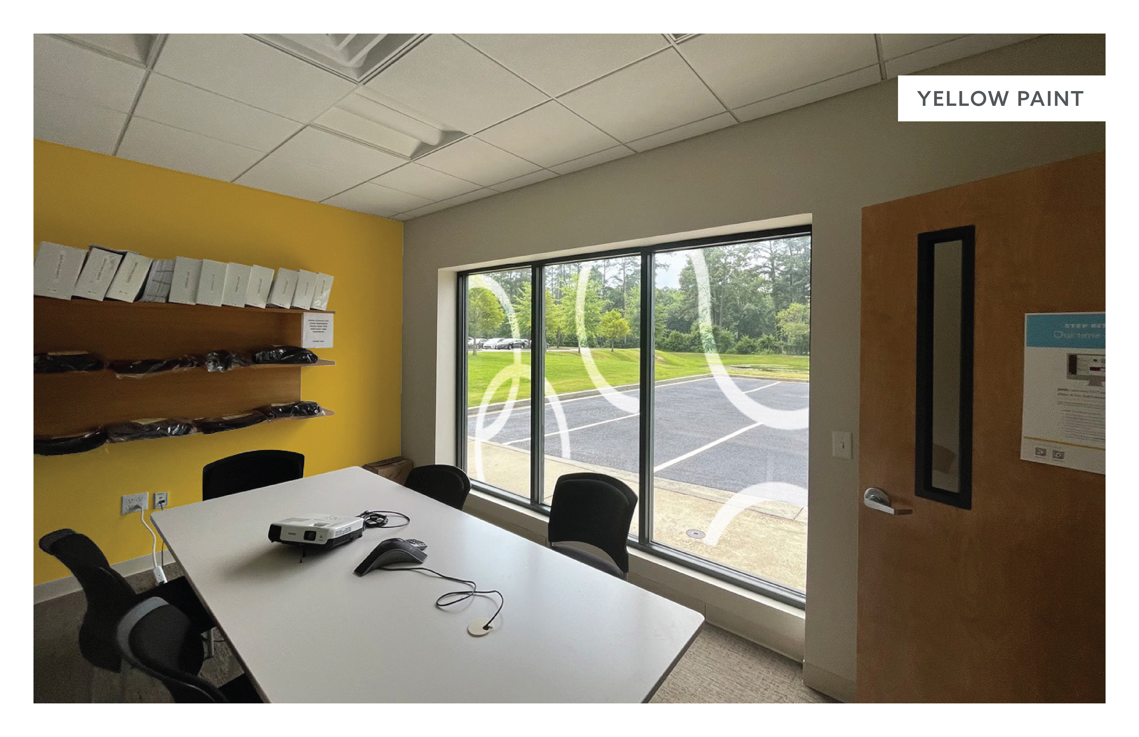
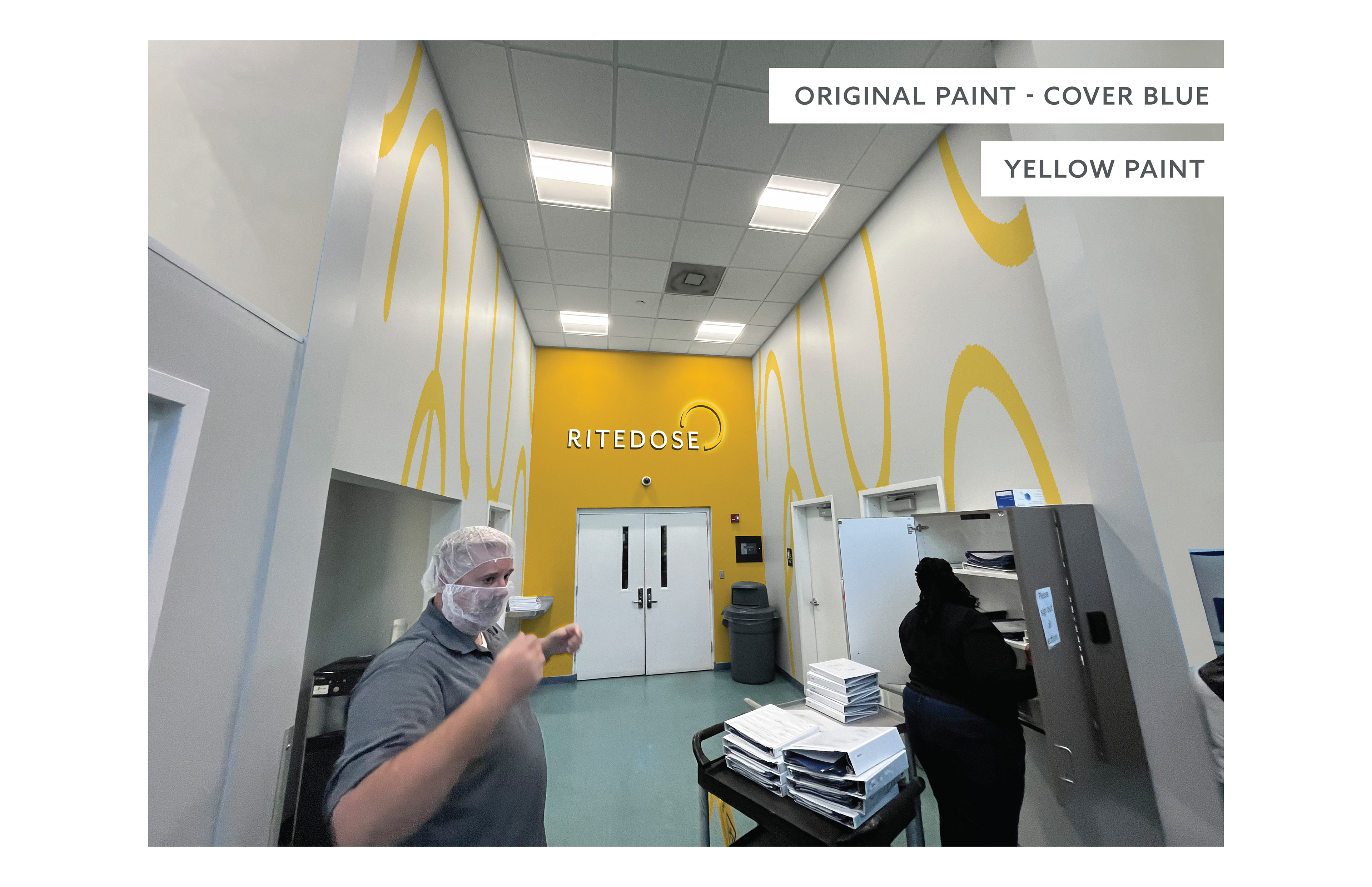
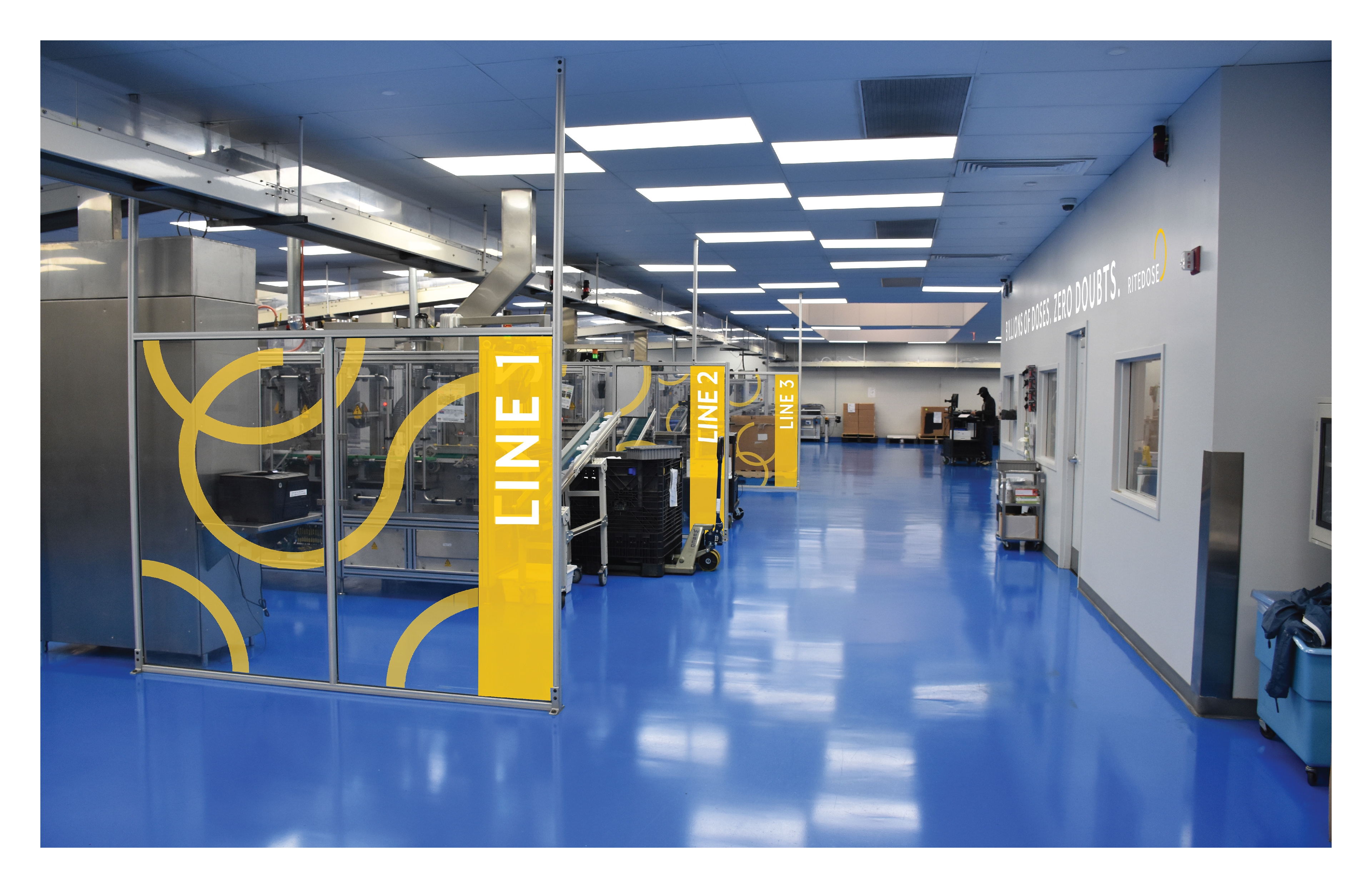
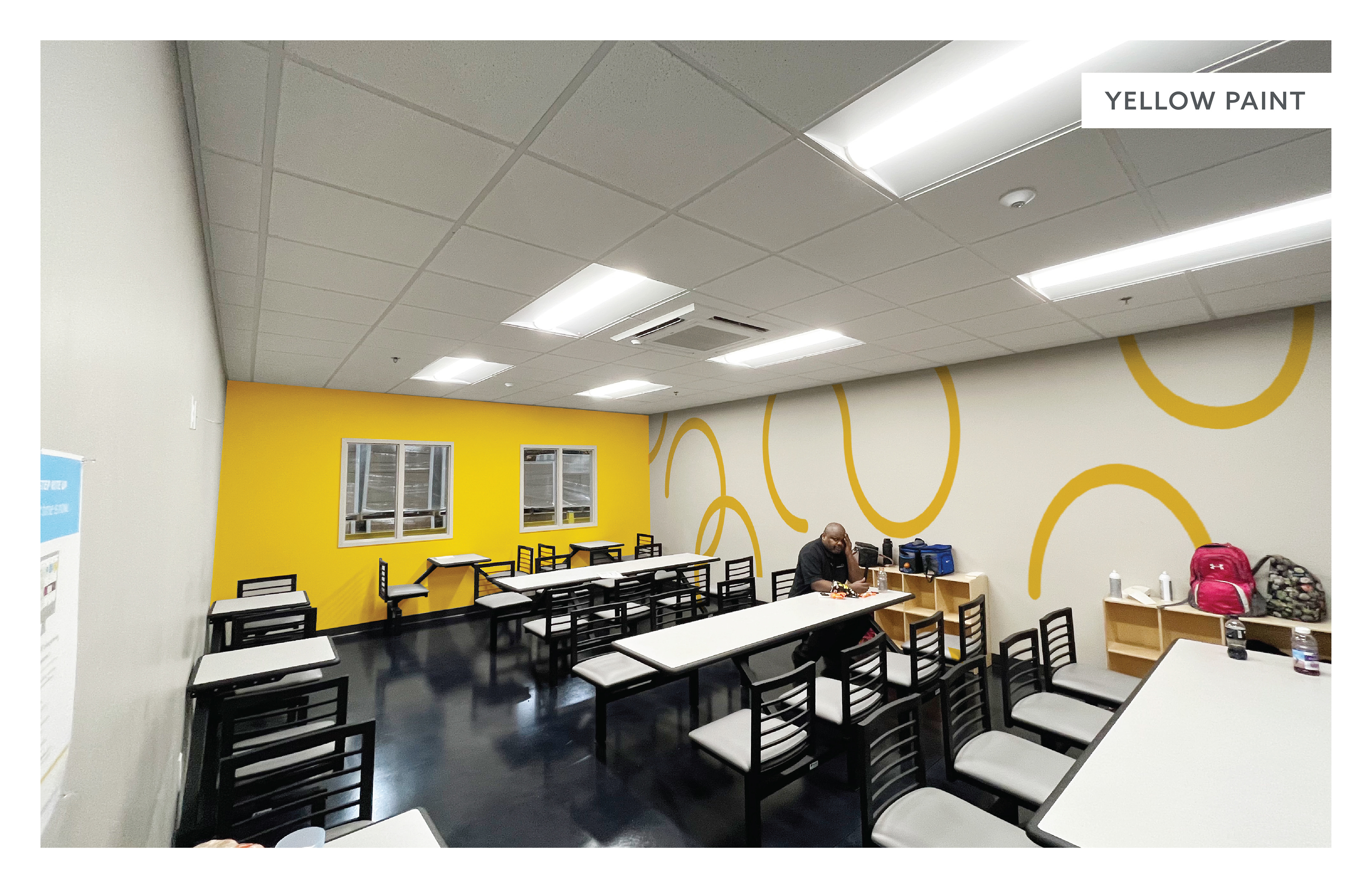
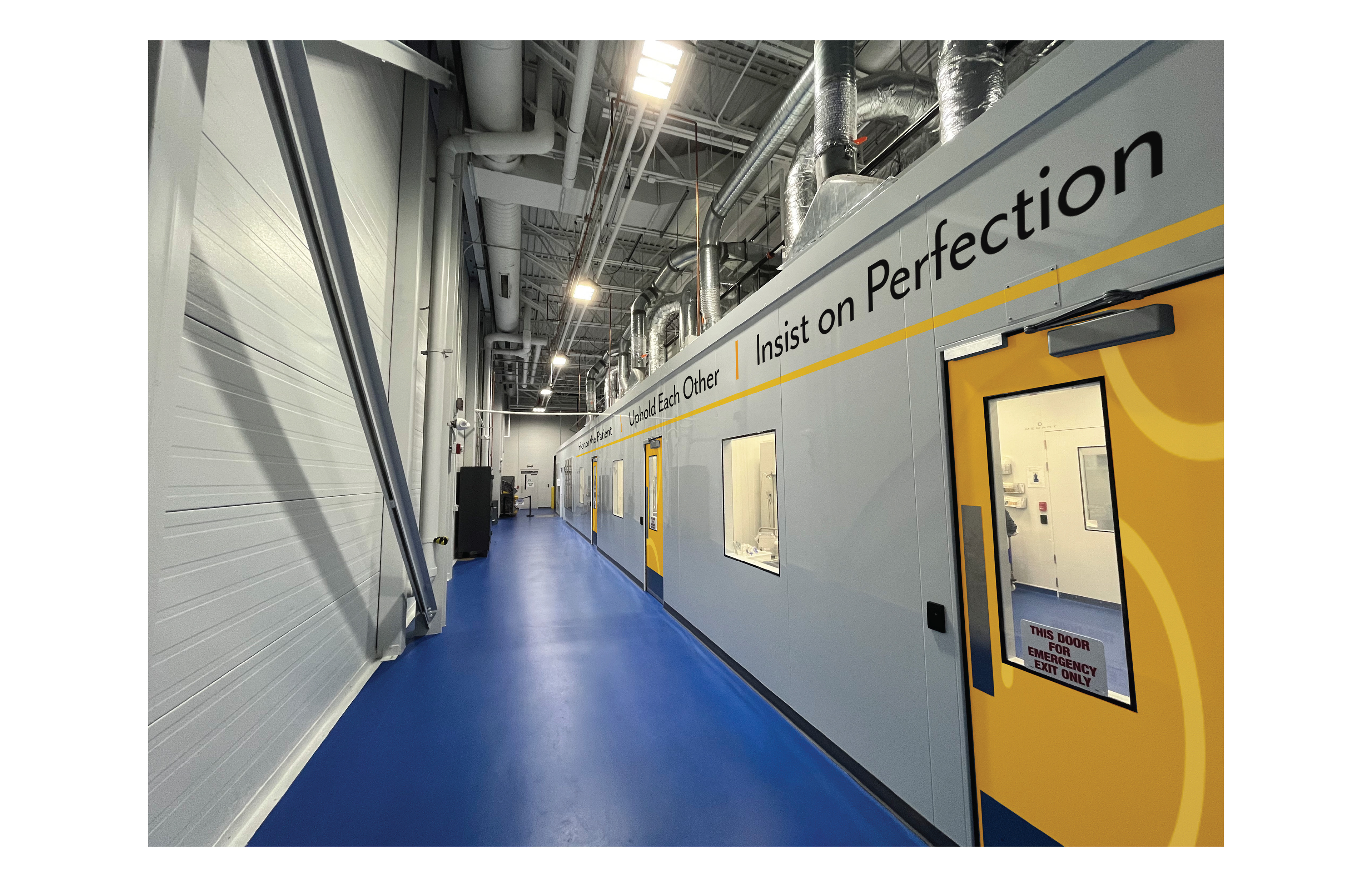
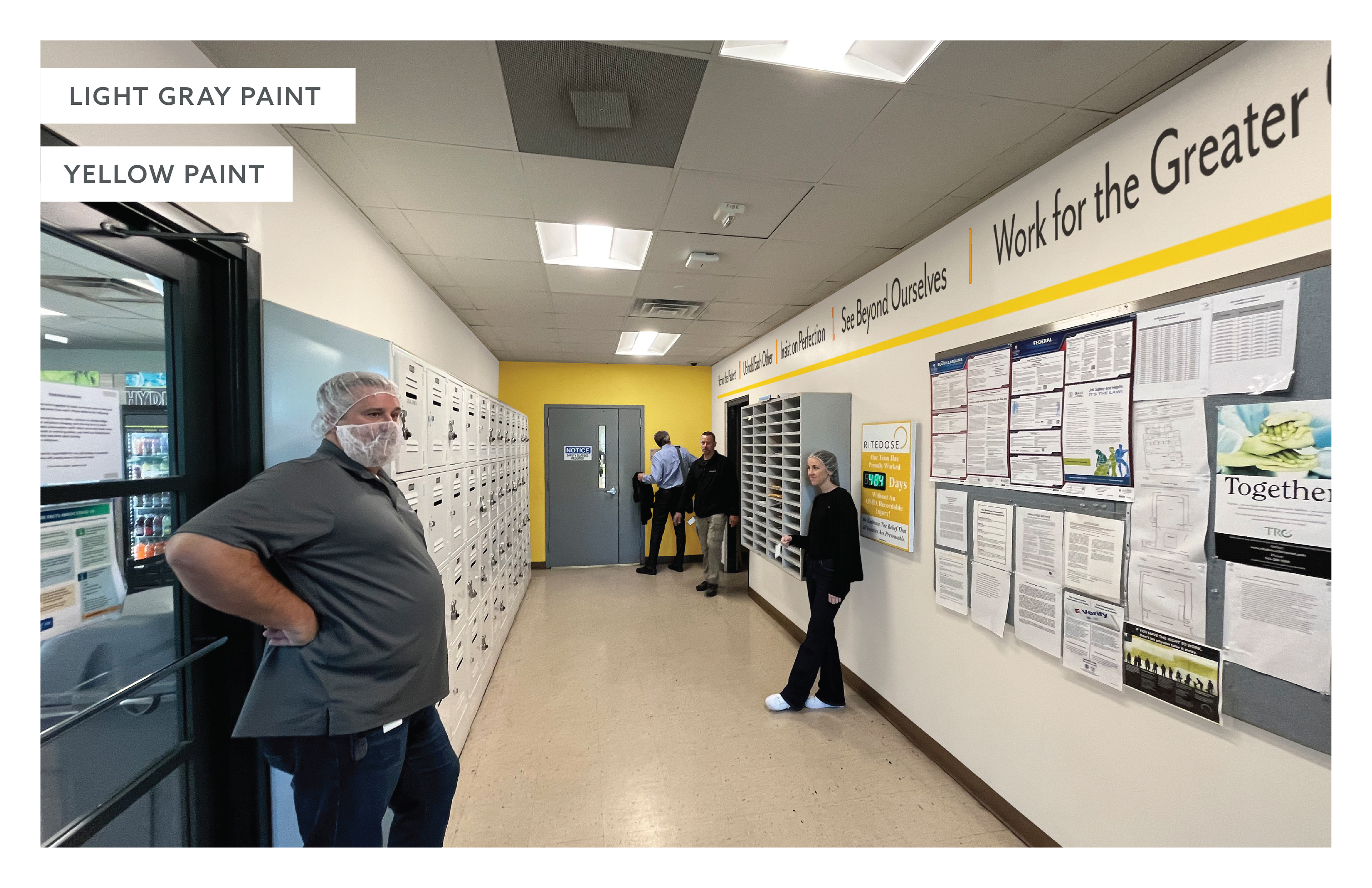
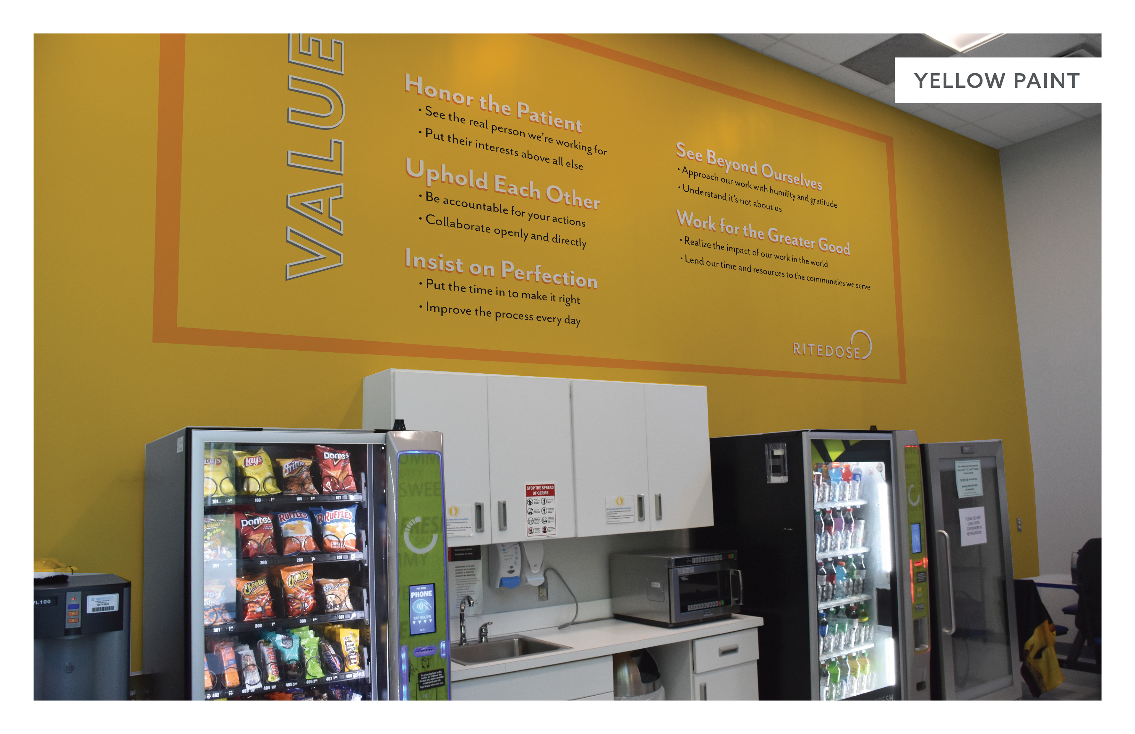
First, we looked at images of the entire facility and looked for opportunities to infuse brand elements in interesting ways. With the brand color palette in mind we embarked on creating a variety of different typographical and graphic elements that we could then place into mockups created with photography of the facilities. The images within this page are screenshots of the presentation as a whole, as you can see by the notes you'll see on some of the images. It is noted whenever an area or wall would need to be painted and changed from the current color at the time.
Patterns
I created this horizontal pattern that could then be placed on walls as decal or wallpaper, and we placed this design a lot of places, even windows. This was in response to the prompt of creating a more lively work environment.


Additionally, we decided on a fabric pattern that could then be used to reupholster chairs and be placed within the office areas.
Banners
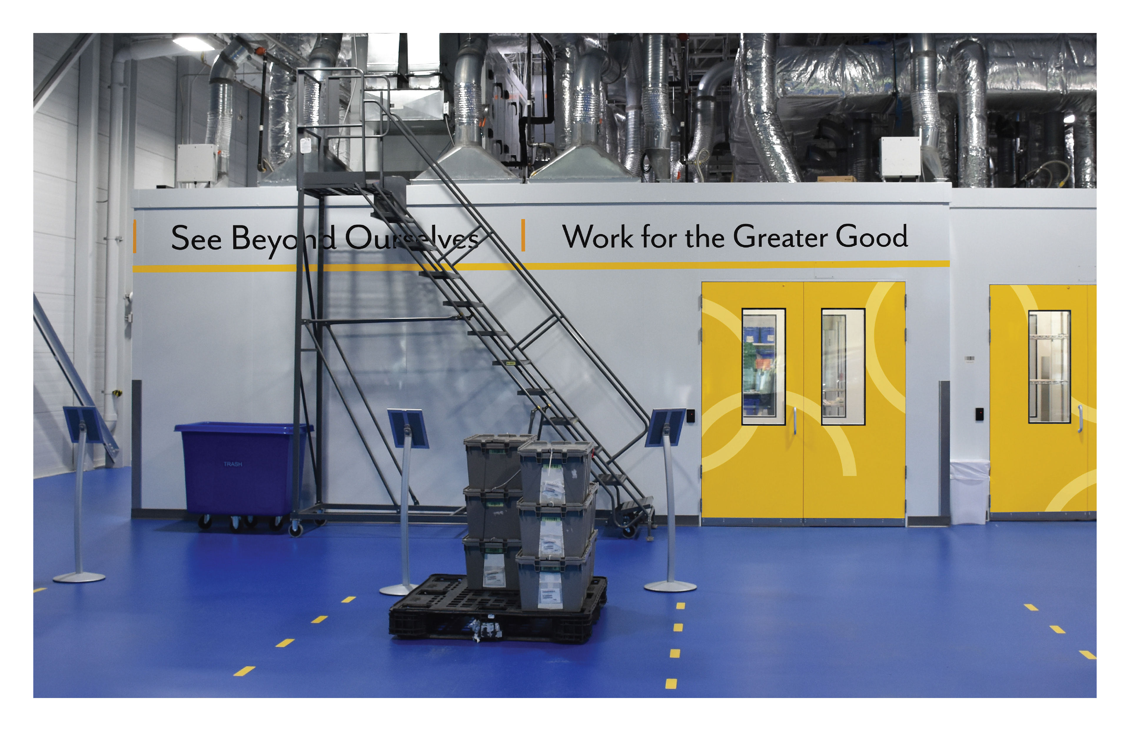
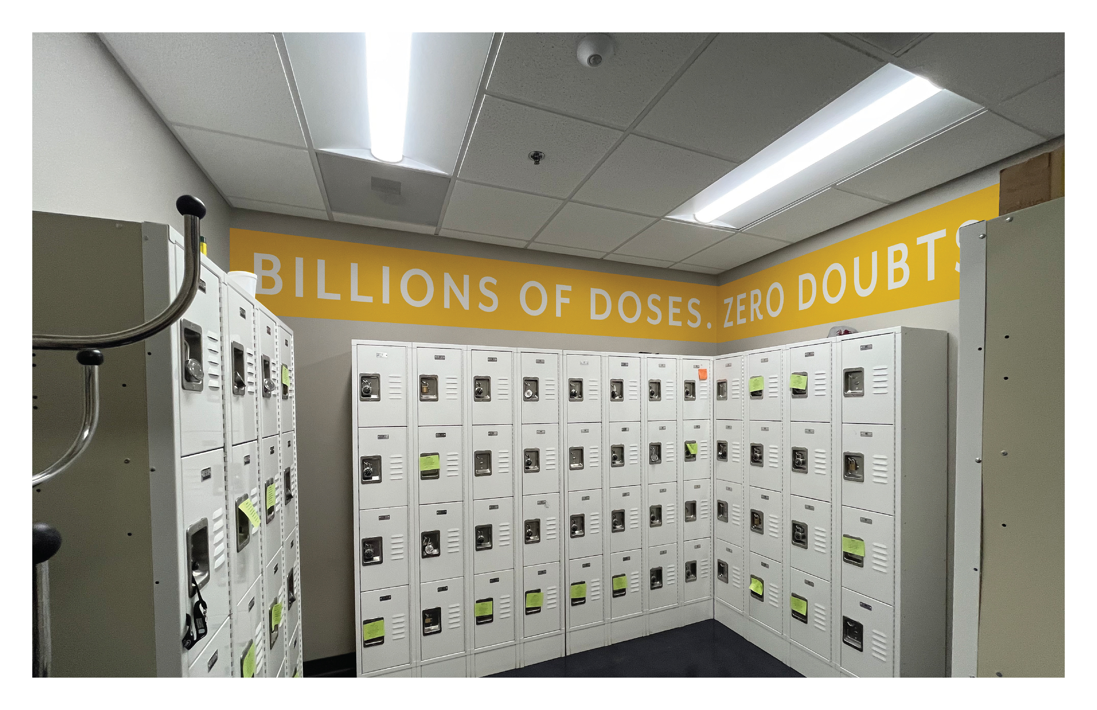
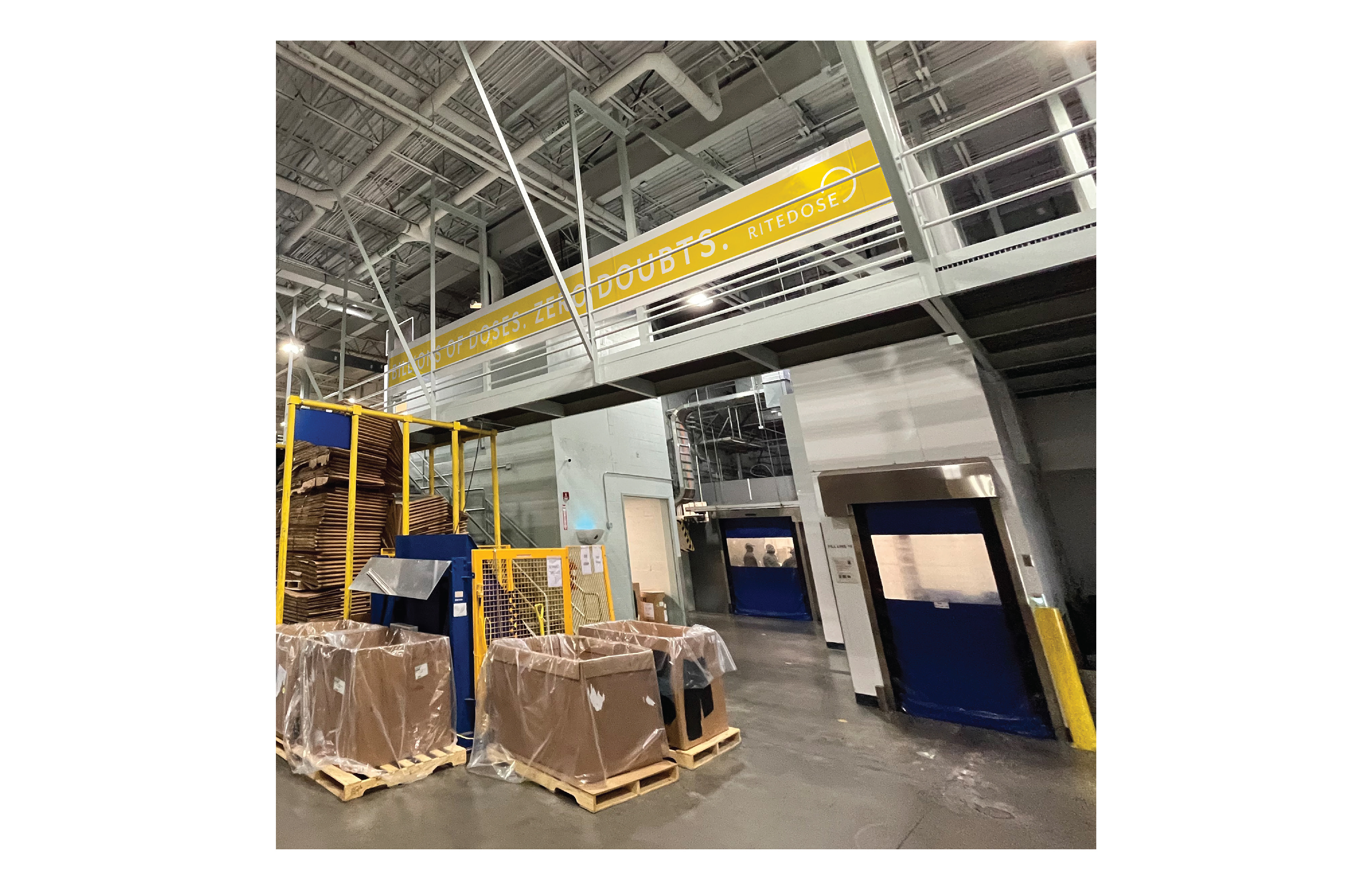
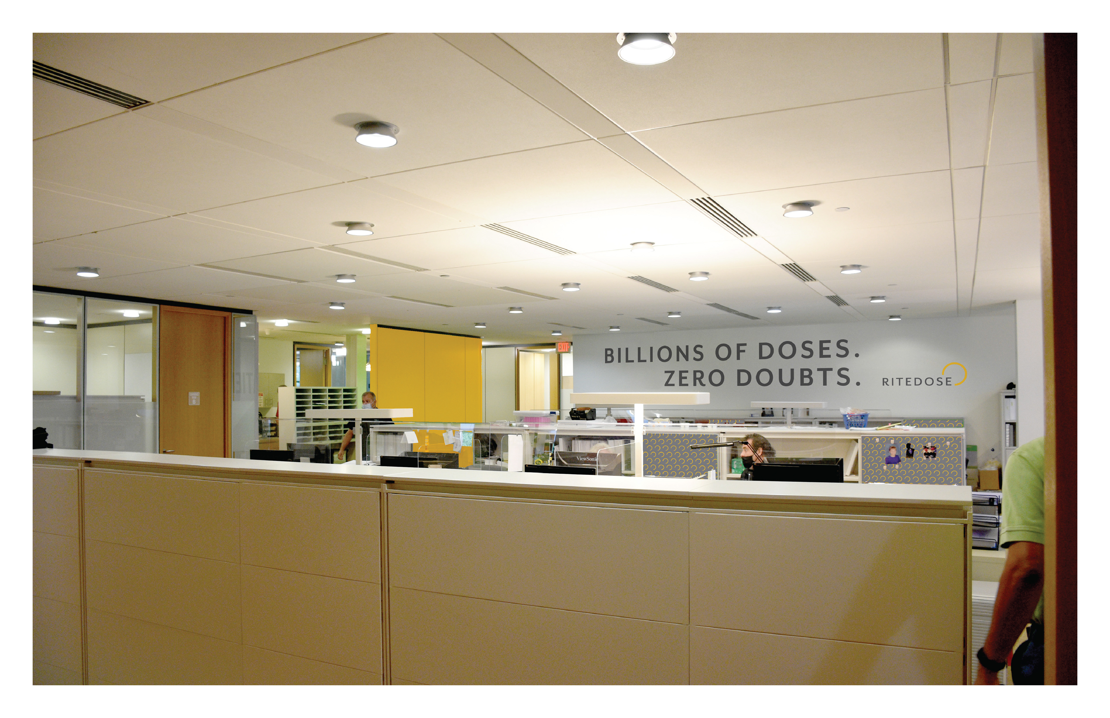
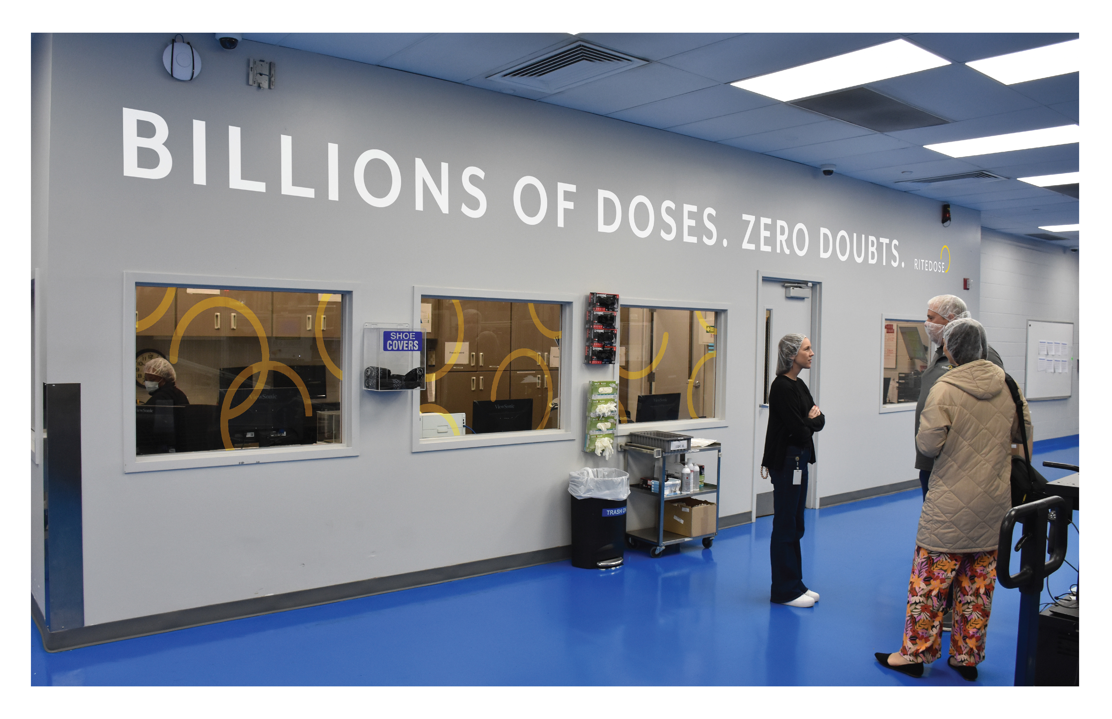
For some areas, long extended designs were necessary and ideal for the display of information. We used a tagline "Billions of Doses. Zero Doubts." which was used in previous promotional materials, and created different compositions.
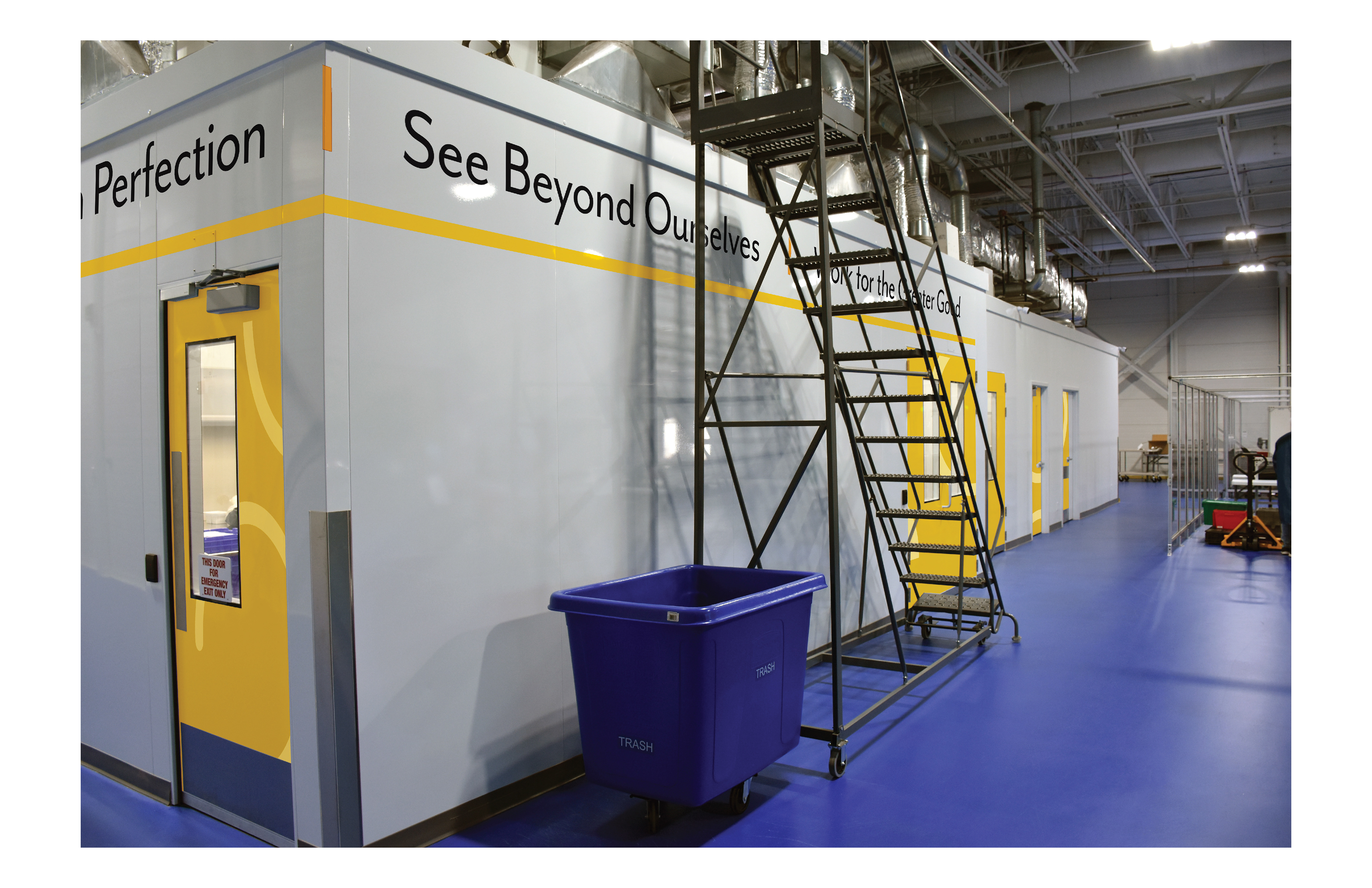
We then placed these within multiple areas with different treatments for each, sometimes wrapping corners or changing colors.
Values
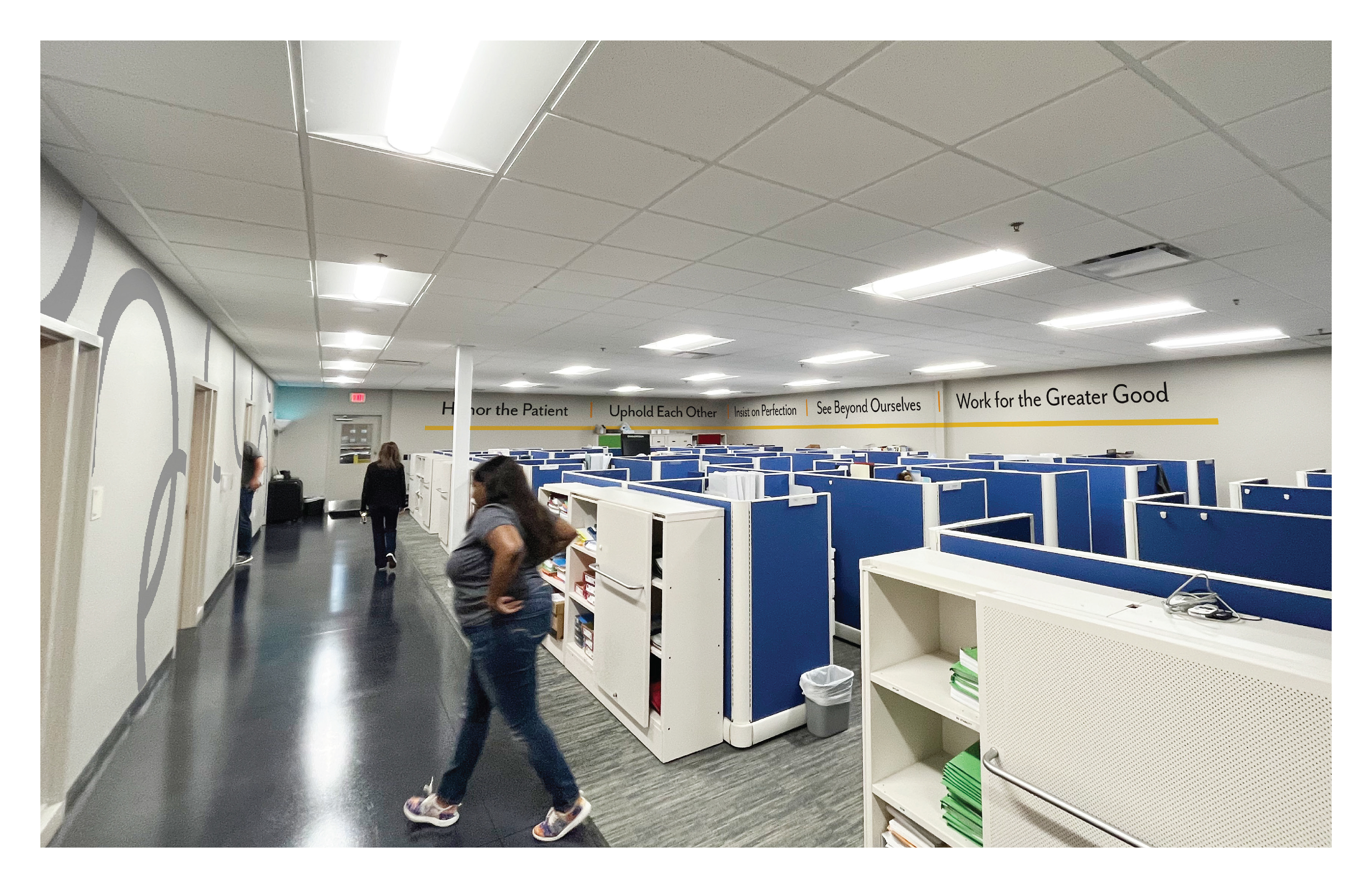
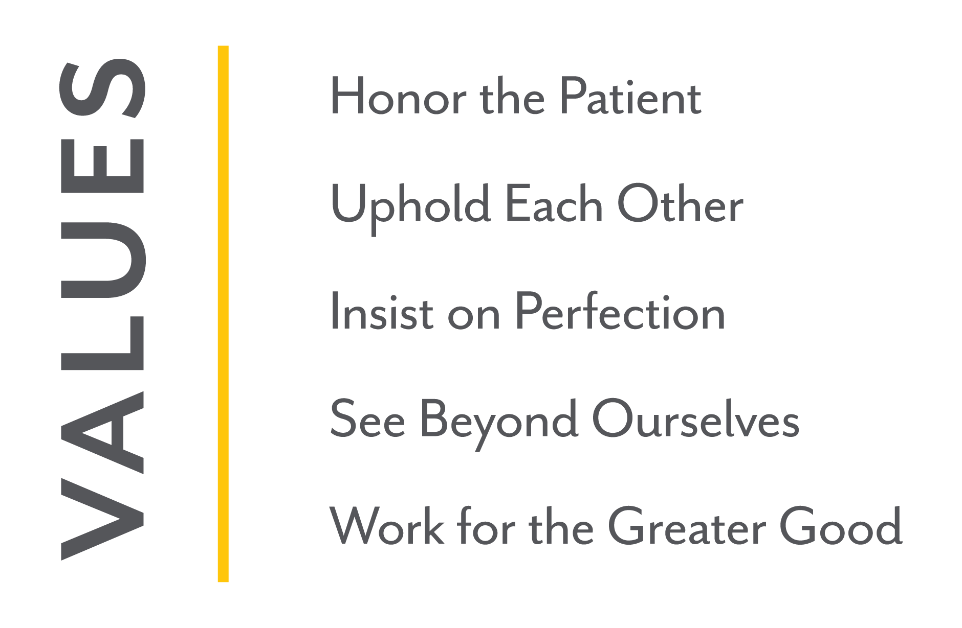
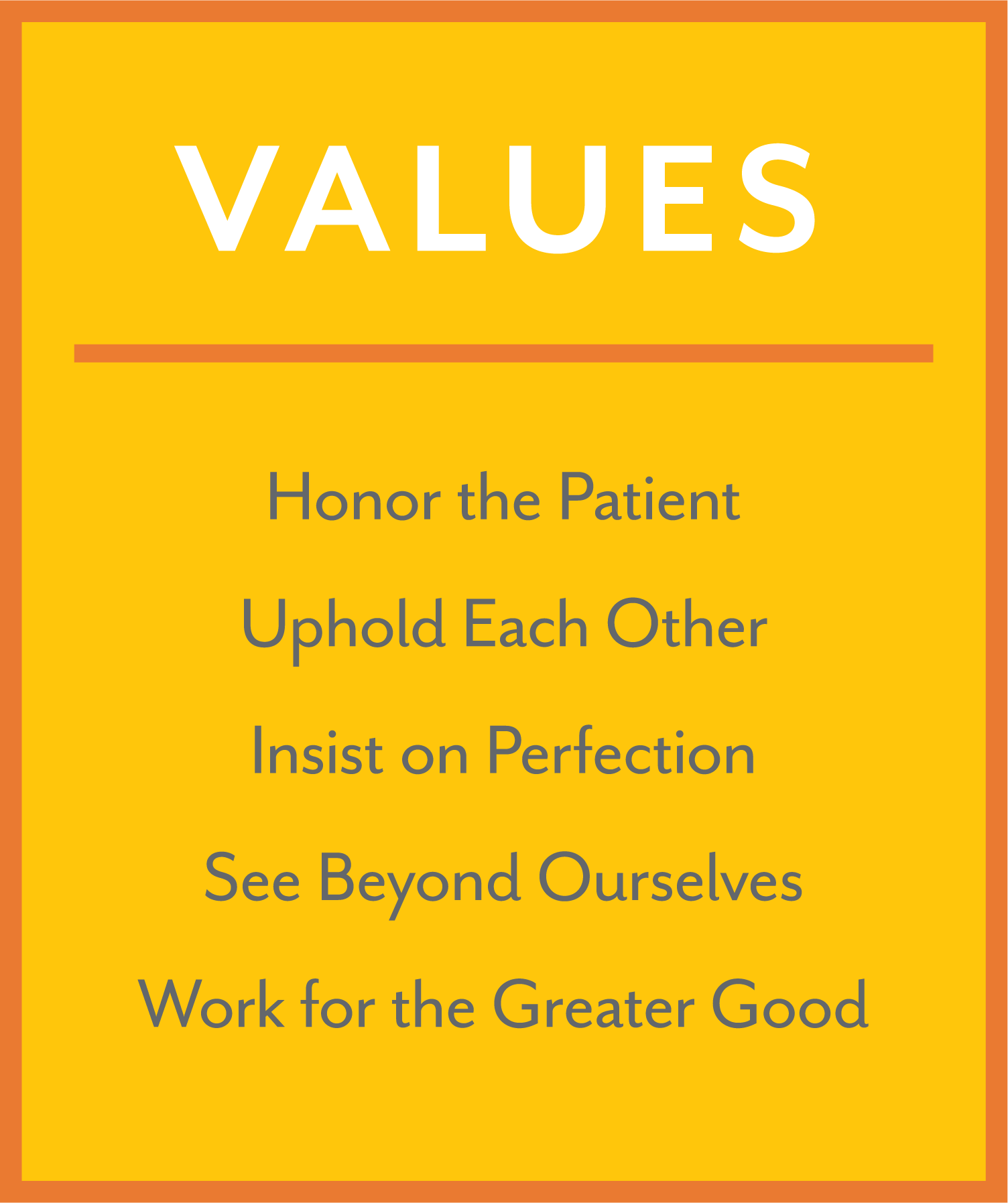
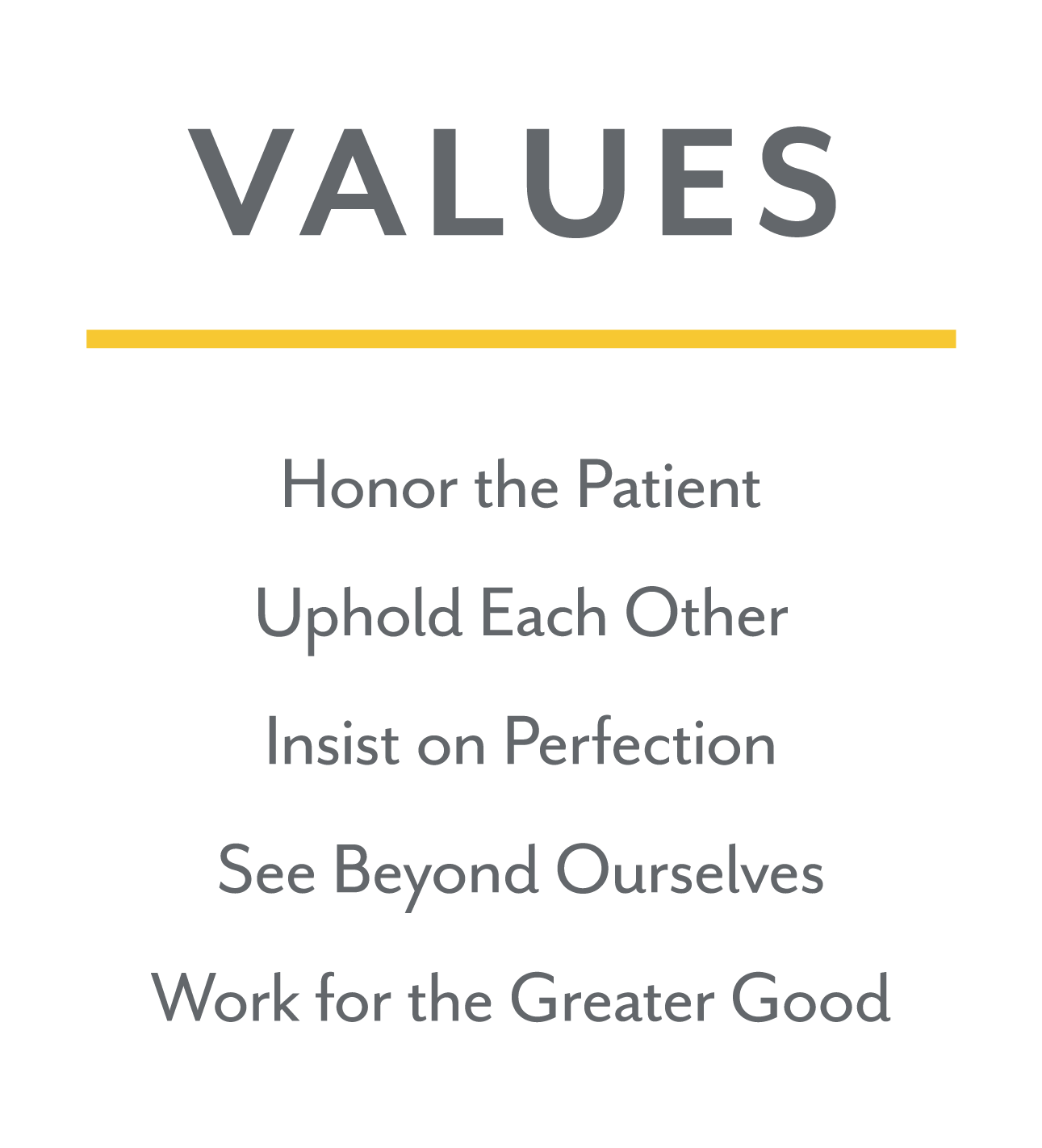
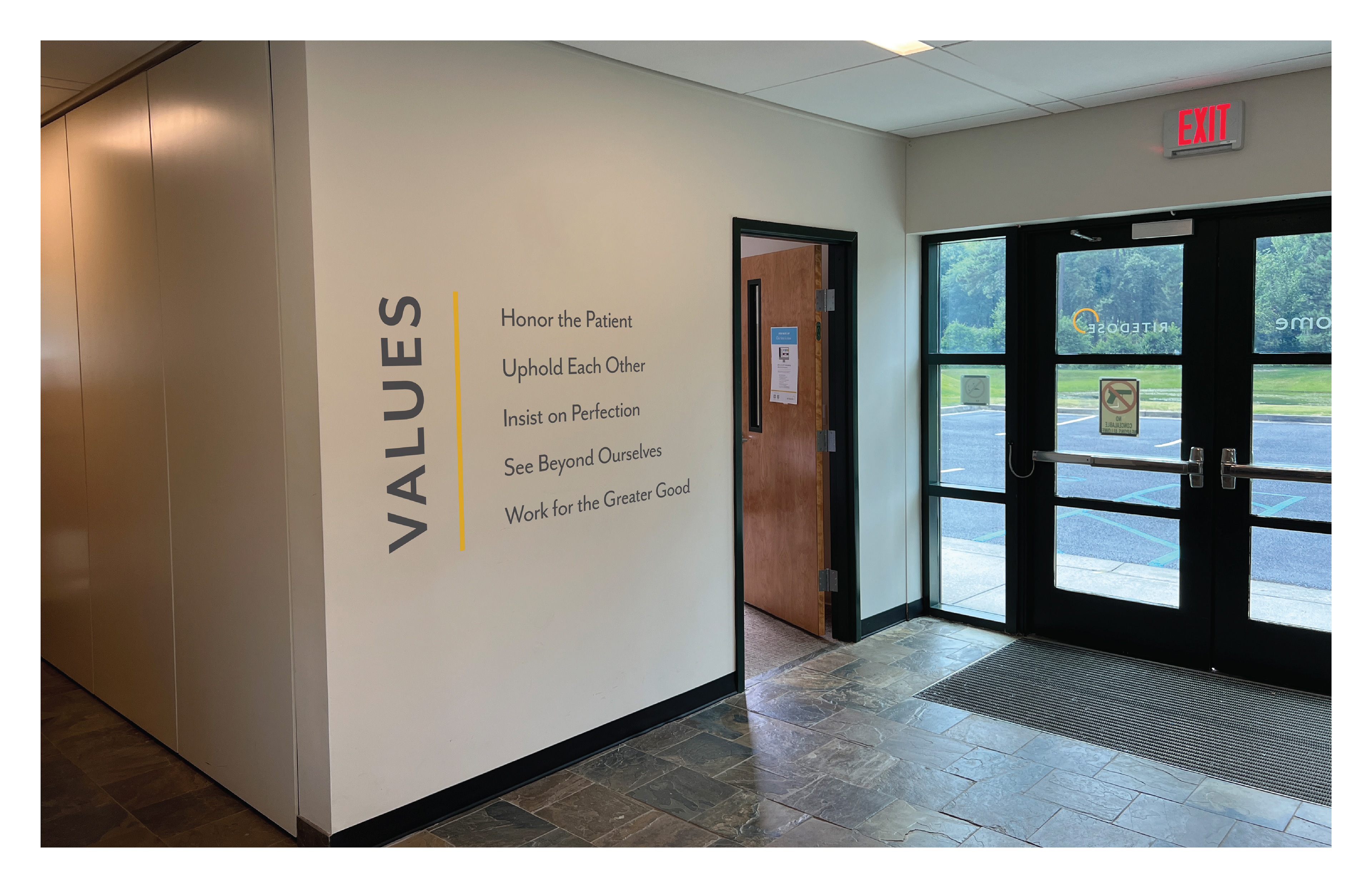
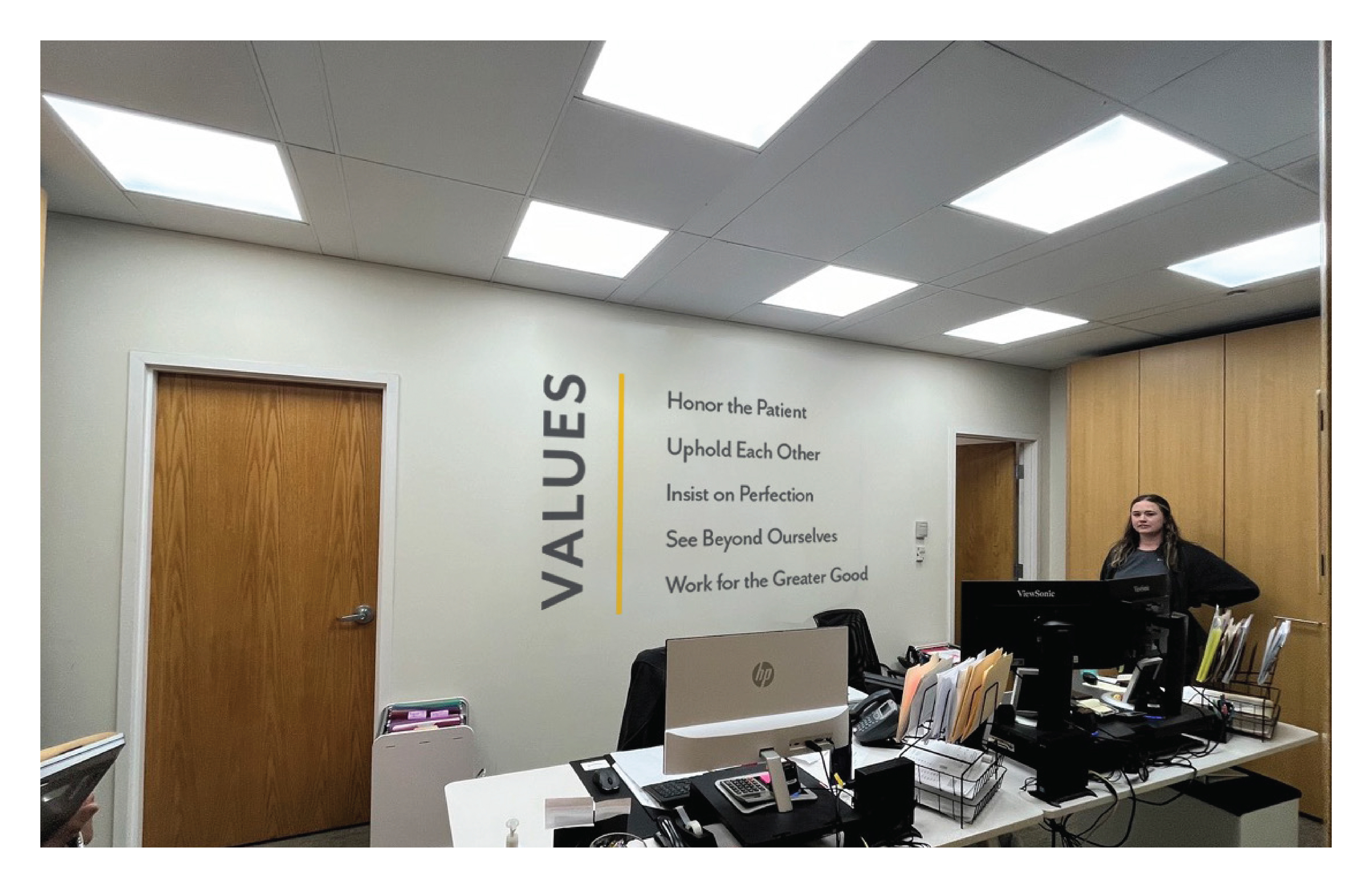
Values were one of the most important aspects that Ritedose wanted to highlight within their facilities. We came up with different variations of showing the values whether that be in vinyl decal or a panel, depending on the needs of the space.

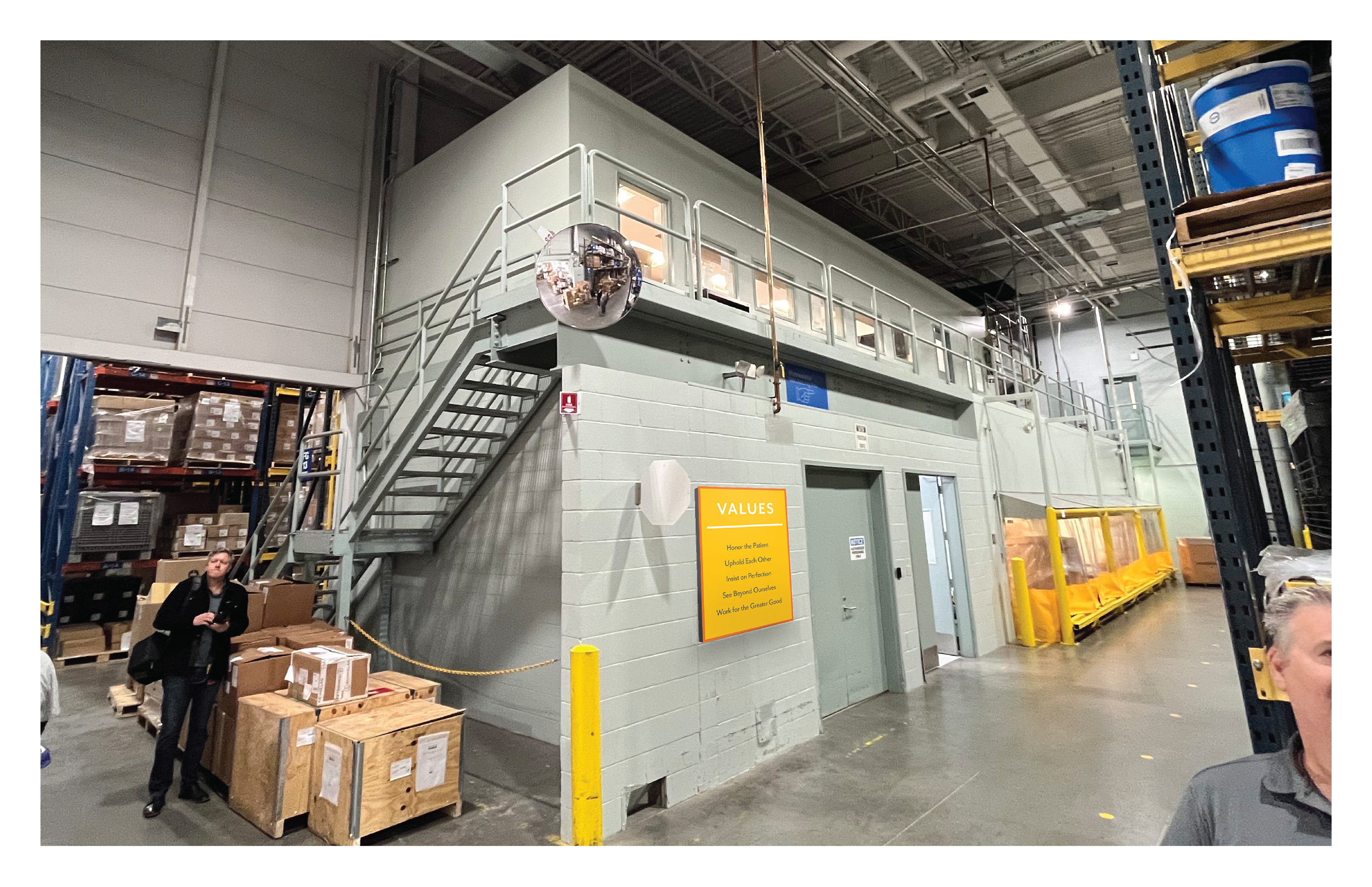
Additionally, we also wanted to make sure the warehouse workers had visibility of the company values, but there wasn't a lot of free wall space that was highly visible in this large area. Our solution was to make a set of banners that could be hung on the columns within the space.
Purpose, Mission, and Vision mural
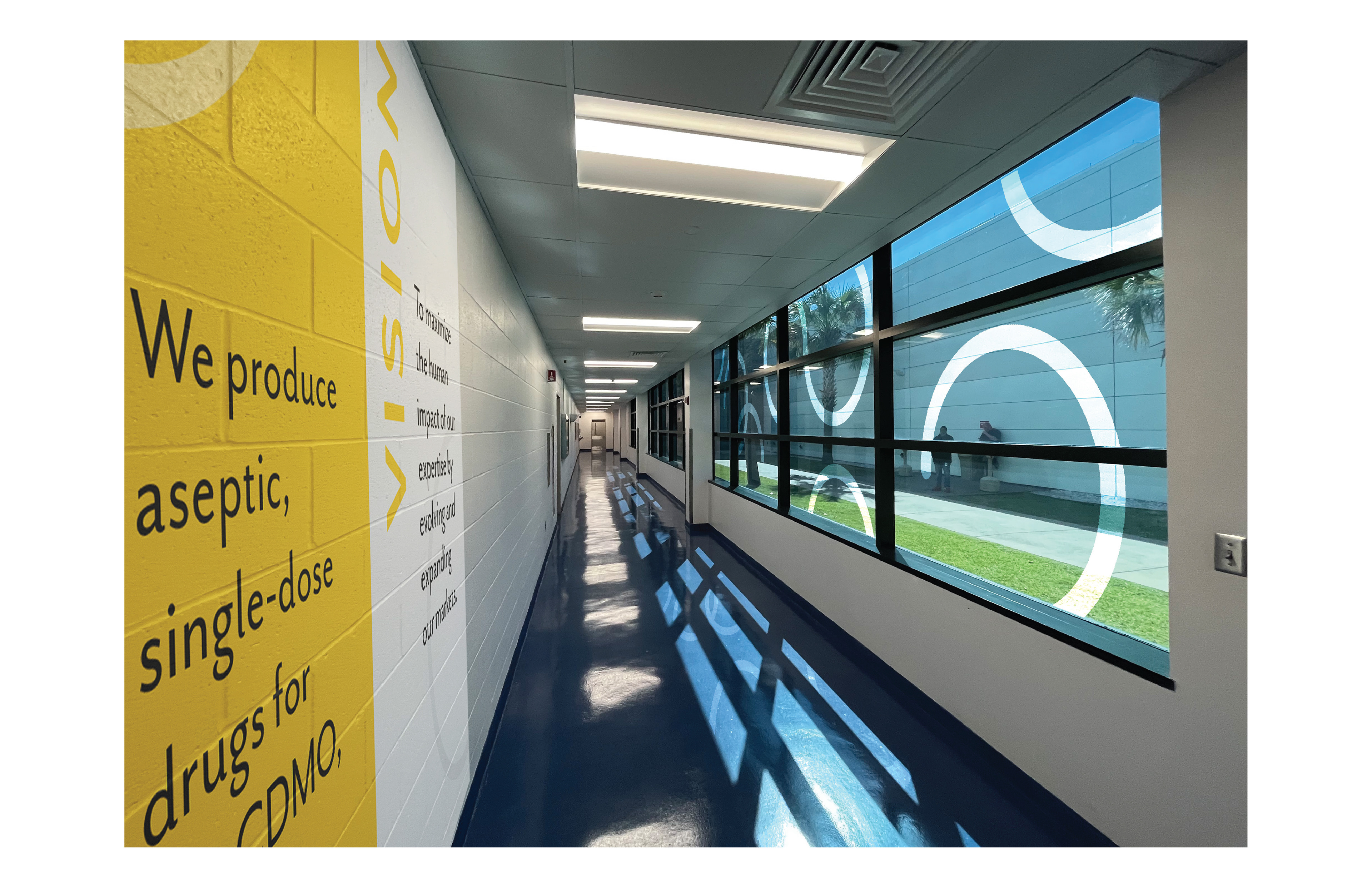
Throughout the facilities, we found fun opportunities to wrap elements around corners. To take advantage of this we made a complete wall wrap that could communicate the company's purpose, mission, and vision. This was placed in both the warehouse and corporate offices.
This wall decal is on a cinder block wall and would be heat treated to be able to fully conform to the wall's texture. A site visit was done with an environmental signage professional to confirm and revise all production details, which revisions were then made as needed.
Signage
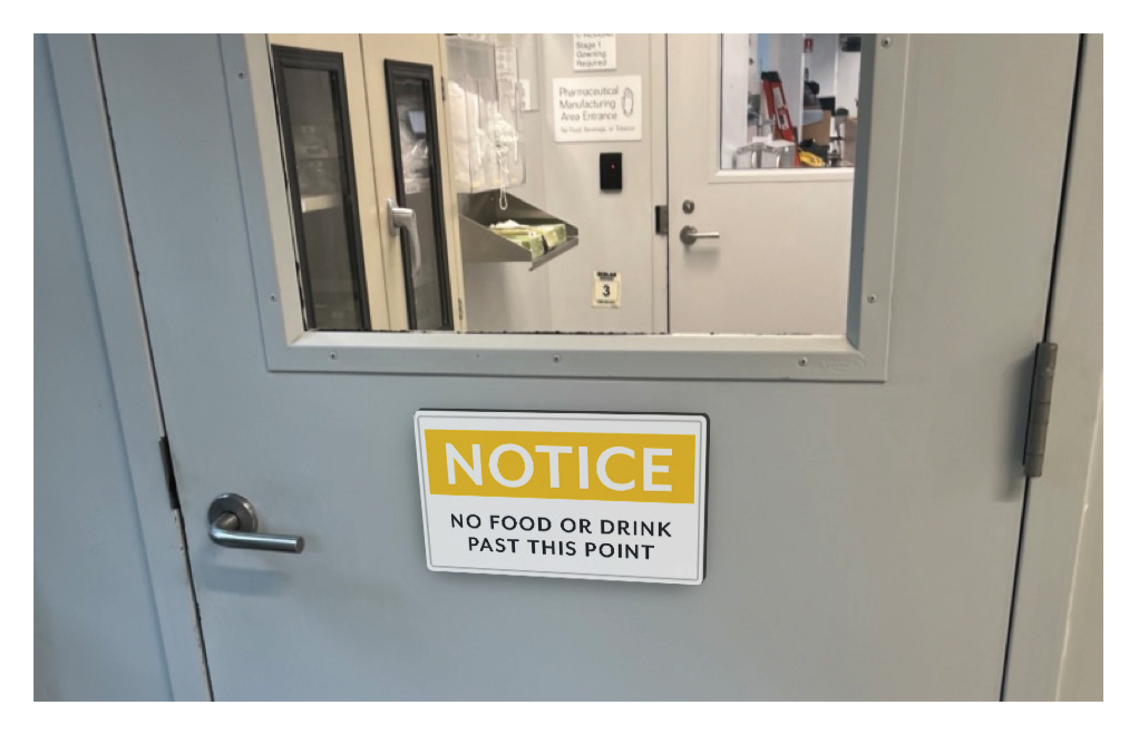
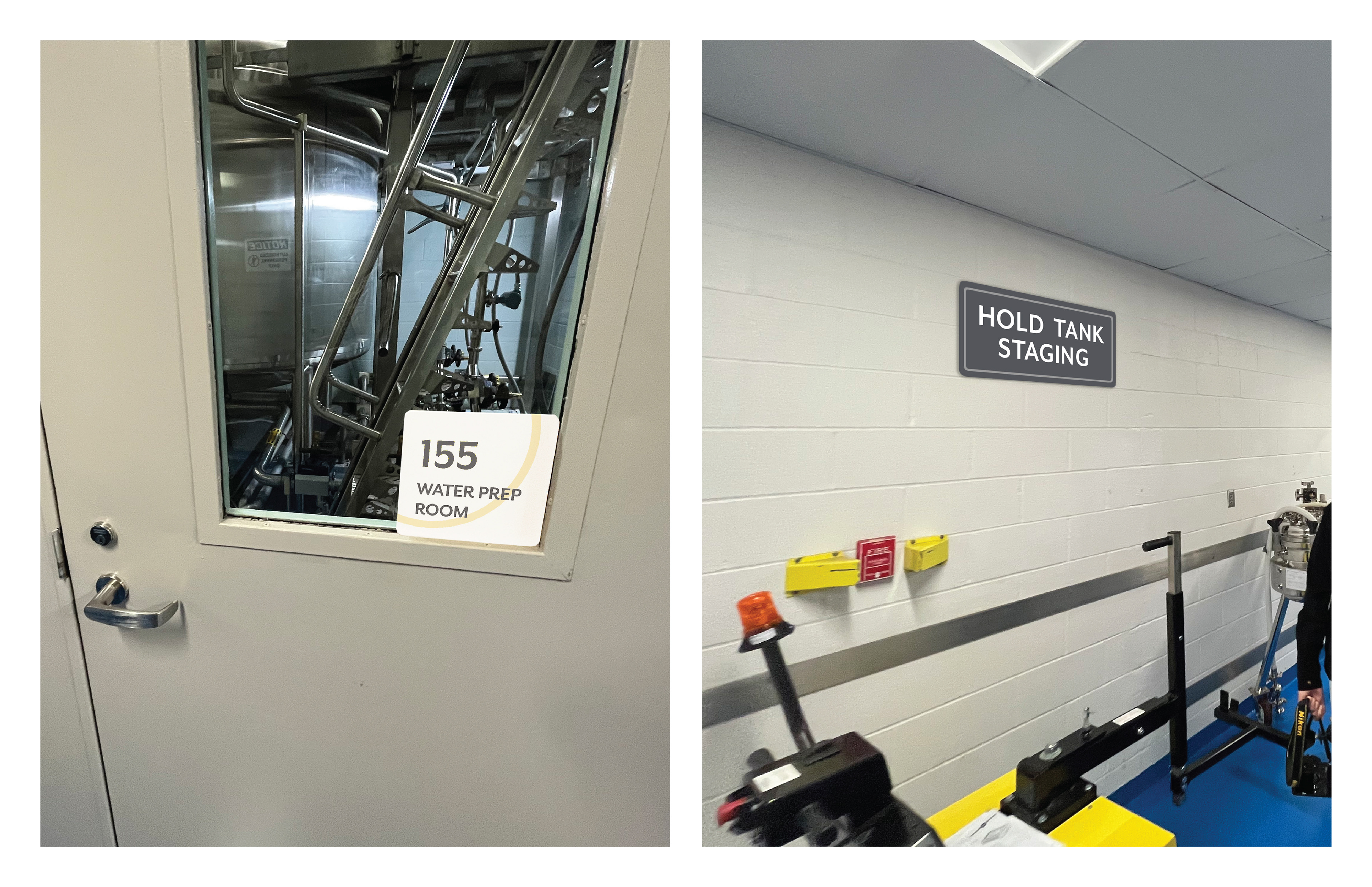
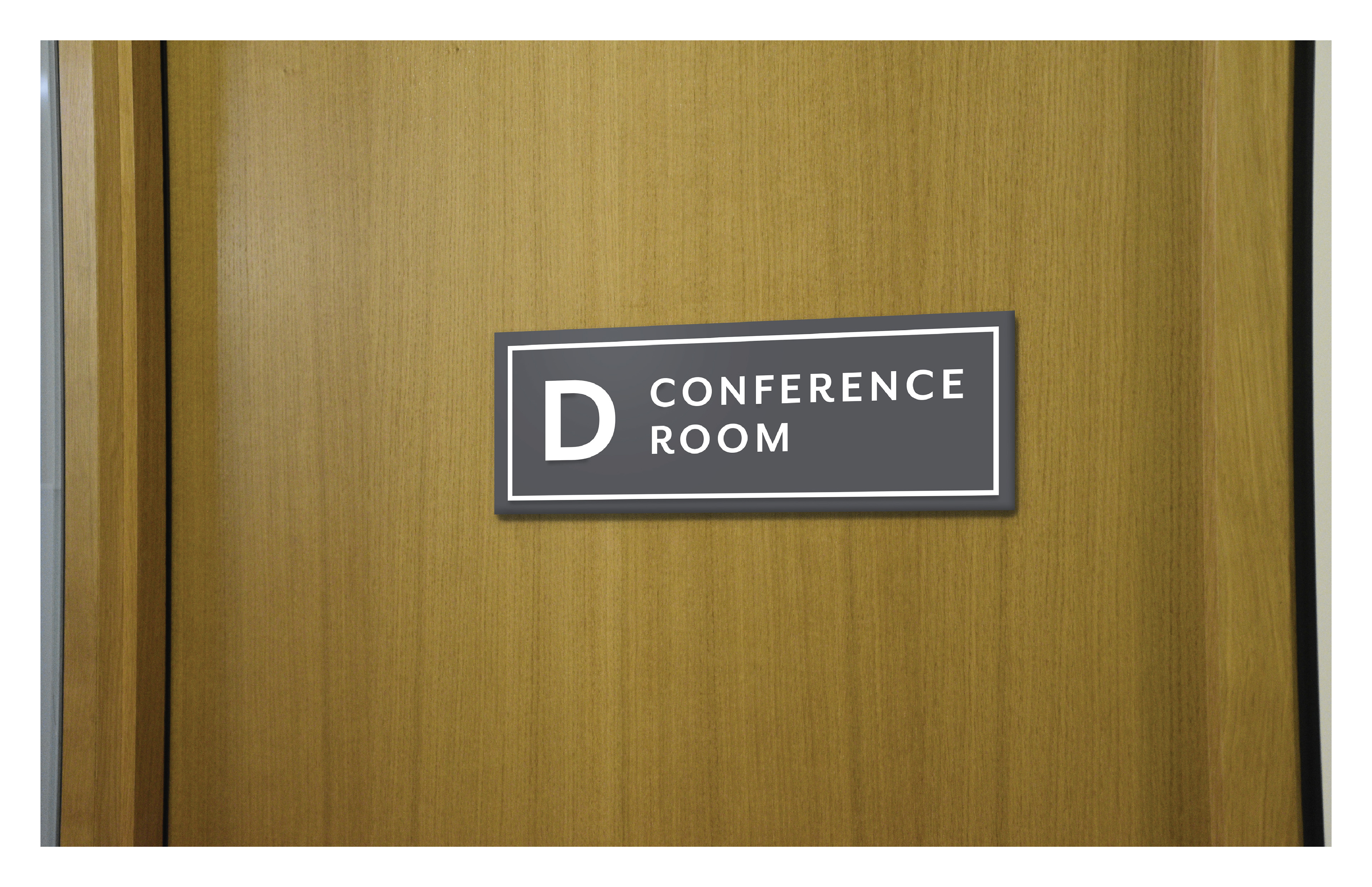
Ritedose also asked us to consider the signage throughout the facilities. For this project, we gave them som ideas of what they're signage could look like, but did not expand on this fully.

This work was done in collaboration with a team at Riggs Partners.
