
The object I was given was a facial cleanser from the brand CeraVe. Though I don’t personally use CeraVe, I know its reputation from those around me who use it as a skincare brand that actually works to fix and repair skin issues, opposed to other brands which don’t seem like they do anything. CeraVe’s main focus is dermatologist curated and approved skincare with specific ingredients that target specific skin problems. They have an extremely wide array of products and on their website you can filter by product type, key ingredient, or skin type. They have found a way to sell generalized skincare that is also targeted to the individuals problems with their extensive product catalog. Here is their list of targeted skin concerns: Acne, Diabetic Skin, Eczema, Itchy Skin, Psoriasis, Rough & Bumpy Skin, Sensitive Skin, Sun Protection, and Dry Skin.
Their full list of products is Eye Creams, Facial Cleansers, Facial Moisturizers, Body cleansers, Body Moisturizers, Facial Serums, Makeup Removers, Sunscreens, Ointments, and things for babies. All of their products are also sold in containers, for reusable daily skincare, but there is an absence of single use products. My recommendation and avenue for this project is to sell single use sheet masks of their products. According GCIMagazine, moisturizer is the most popular skincare product, but 60% of buyers purchased a face mask within the past six months.
CeraVe has products that could be considered a mask of sorts, like their Skin renewing Vitamin C serum, Skin renewing Retinol Serum, and Hydrating Hyaluronic Acid serum. But these are reusable products in smaller tubes. Their Skin renewing Vitamin C serum is normally 30$ at Walmart for a 1 oz tube. Similarly their other serums are in the 20-30$ range. This is expensive for many consumers and a test of these products in a simple face mask could be beneficial for customers to try products, to justify spending a larger amount of money on the reusable product.
Additionally, single use face masks would be a constant source of revenue for CeraVe. Here are some stats from GCIMagazine again: “...56% agree that a sheet mask is an effective way to quickly deliver powerful ingredients to the skin, while 55% say they enjoy using a variety of different brands of sheet masks… 83% say they use sheet masks regularly to boost their skin care routine. Sixty-five percent (65%) purchase/use sheet masks more than they did two years ago, and 54% expect that use to increase over the next two years.” It is easy to see from these statistics that single use sheet masks are a rapidly growing area of skincare that CeraVe is not yet capitalizing on. Even when I go to stores like Target and CVS, sheet masks are everywhere compared to about 5 years ago.
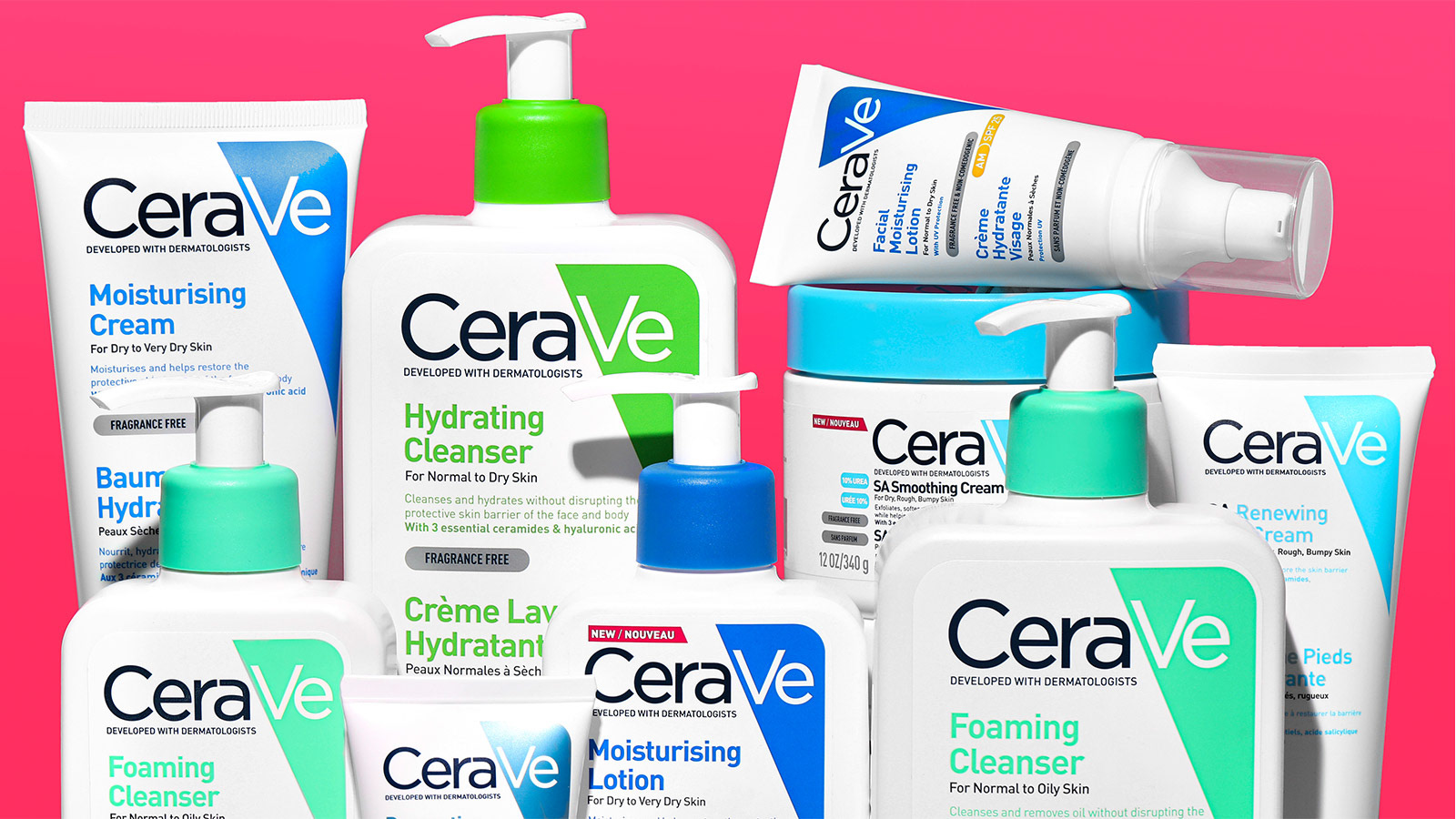
Additionally, their branding is effective for their brand mission. Because their skincare is science focused, it makes sense that their visual identity is more corporate. All their skincare is in white containers with a colored system that helps identify product line. “The colors represent the different lines. The blue line is the moisturizers, the green is the cleansers, the purple is the Skin Renewing line (which can contain retinol),” CeraVe says on Facebook responding to a customer comment. However, they also have a navy which is for nighttime products, yellow for sunscreens, red for eczema/itchness, a separate blue for baby products, and many other random choices that don’t seem to make complete sense. Overall though, it seems like things are organized based on skin concern. This is shown by a triangle in the corner. For this project I plan to stay pretty much within the CeraVe brand system but refresh it a little. Something that is common for single use face mask products is to be really bold and fun and exciting, and I want to stay away from that for these products because they are still meant to be scientific skincare. I want the quality of the material to be the most visible thing about the packaging and also stay within the CeraVe brand identity. I will, however, update the CaraVe brand a little to be more design forward and make the colors a little more cohesive.